So, you’re ready to build your school’s brand guidelines. Where do you even begin? It's tempting to jump straight into picking fonts and colors, but the real work starts with a bit of a treasure hunt and some deep thinking. Before you can write the rules, you have to understand the foundation: your strategy.
This whole process is about codifying your school's unique identity—its mission, vision, and values—so that it shines through in everything you create.
Build Your Brand's Foundational Strategy

Before you can decide how your brand should look and sound, you need an honest picture of what it looks and sounds like right now. This means rolling up your sleeves and conducting a brand audit. Think of it as an archeological dig through your district's communications.
Start by gathering every single piece of branded material you can get your hands on. And I mean everything—not just the polished brochures from the district office.
- Official Stuff: Think annual reports, recruitment packets, and school board presentations.
- Digital Footprint: Grab website banners, social media posts from every school account, email newsletters, and video clips.
- Internal Comms: Pull staff memos, parent-teacher conference flyers, and graphics from the internal portal.
- The "Wild West" Materials: This is the important stuff. The t-shirts for the school play, hastily made posters for a bake sale, and the athletic team's unofficial announcements.
Laying it all out will likely reveal some chaos. You might find five different versions of the school logo being used, or a dozen different shades of your official "school blue." Don't see these as failures. They're valuable data points that prove just how much clear, accessible guidelines are needed.
Define Your Core Identity
With your audit complete, it’s time to solidify the pillars of your brand strategy. This isn’t a task for one person in a quiet office; it’s a conversation. Get key people in a room together—administrators, teachers, communications staff, and even a few insightful parents or students.
Your goal is to get consensus on these three core elements:
- Mission: Why do we exist? What is our district’s fundamental purpose?
- Vision: Where are we headed? What does success look like five or ten years from now?
- Values: What are the non-negotiable principles that guide every decision we make?
These statements become the bedrock of your brand. They are the "why" behind every logo placement and color choice you’ll make later. For instance, if one of your core values is "Community," your guidelines should naturally lead to warm, inclusive imagery and a welcoming tone of voice.
Translate Your Strategy Into a Personality
Once you’ve nailed down your mission, vision, and values, you can start to give your brand a distinct personality. This is the step that makes your school feel human and relatable. Is your district more like a wise, tenured professor or an energetic, first-year teacher?
Think about where your school falls on these spectrums:
- Formal vs. Casual: Do you speak with institutional authority or in a friendly, conversational style?
- Traditional vs. Modern: Does your identity honor long-standing traditions or celebrate cutting-edge, forward-thinking programs?
- Playful vs. Serious: Is your overall vibe lighthearted and fun, or is it more reserved and academic?
Key Takeaway: Answering these questions ensures your brand guidelines feel authentic to who you are. This foundational work prevents you from creating a set of rules that look great on paper but feel totally disconnected from the actual culture of your schools.
This strategic groundwork is what makes consistency possible. When your guidelines are anchored to a shared purpose, they empower everyone—from the superintendent to the parent volunteer—to become a true brand advocate.
And that consistency matters immensely. After all, research shows that 55% of a brand's first impressions are visual, which really drives home the importance of getting that logo usage and color palette right every single time. If you want to dive deeper, you can find more stats and insights by exploring research on brand consistency.
Defining Your Core Visual Identity
Now that you've laid the strategic groundwork, it's time for the fun part: translating those big ideas into a visual language everyone can understand. This is where your brand stops being an abstract concept and starts becoming something people can see and recognize instantly.
Getting this right is your best defense against "brand drift"—that slow, quiet erosion of consistency that happens when everyone from the art teacher to the front office secretary is left to their own creative devices.
Your visual identity really comes down to three key pillars: your logo, your color palette, and your typography. Let’s get practical and lock these down so your entire team has a clear, easy-to-follow roadmap.
Nail Down Your Logo Usage Rules
Your logo is the most concentrated symbol of your school or district. It needs to be treated with respect. The first thing to do is set some non-negotiable rules for how it can and can't be used. Think of it like creating a personal space bubble for your logo, making sure it always has room to breathe and make an impact.
Start by defining the clear space requirement. This is the minimum amount of empty space you need around the logo at all times. A great rule of thumb is to use a part of the logo itself—like the height of your mascot or the width of a letter—as the unit of measurement for this buffer zone.
Next, you need to specify its minimum size. Your logo has to be legible whether it’s blown up on a gym wall or shrunk down for a social media profile picture. Figure out the absolute smallest it can appear in both print (in inches or millimeters) and digital (in pixels) before it just turns into an unreadable smudge.
Finally, make sure to provide all the approved color variations. Your main, full-color logo simply won't work everywhere. You'll need to supply:
- A full-color version for white or light backgrounds.
- An all-white (or "knockout") version for dark or busy colored backgrounds.
- An all-black version for things like single-color printing or specific internal documents.
The Power of Showing What Not to Do
Honestly, one of the most effective pages in any brand guide I've ever built is the "logo misuse" section. Just telling people what to do often isn't enough; you have to explicitly show them what not to do. This removes all the guesswork.
Create a simple visual grid showing common logo mistakes, each with a big red "X" through it. It gets the point across fast.
Some classic no-nos include:
- Stretching or squashing the logo out of proportion.
- Recoloring it with unapproved colors (no, it can't be hot pink for the bake sale flyer).
- Placing the logo on a cluttered photo where it gets lost.
- Adding drop shadows, glows, or other cheesy visual effects.
- Rotating the logo at a weird angle.
This section isn't about stifling creativity; it's about preventing well-intentioned staff from making choices that accidentally weaken the brand you've worked so hard to build.
Define Your Official Color Palette
Color is incredibly powerful. It triggers emotion and memory, and a consistent color palette makes your district instantly recognizable. When you're defining this in your guidelines, you have to be painstakingly precise.
This infographic gives a fantastic breakdown of how a brand's color palette is typically structured.
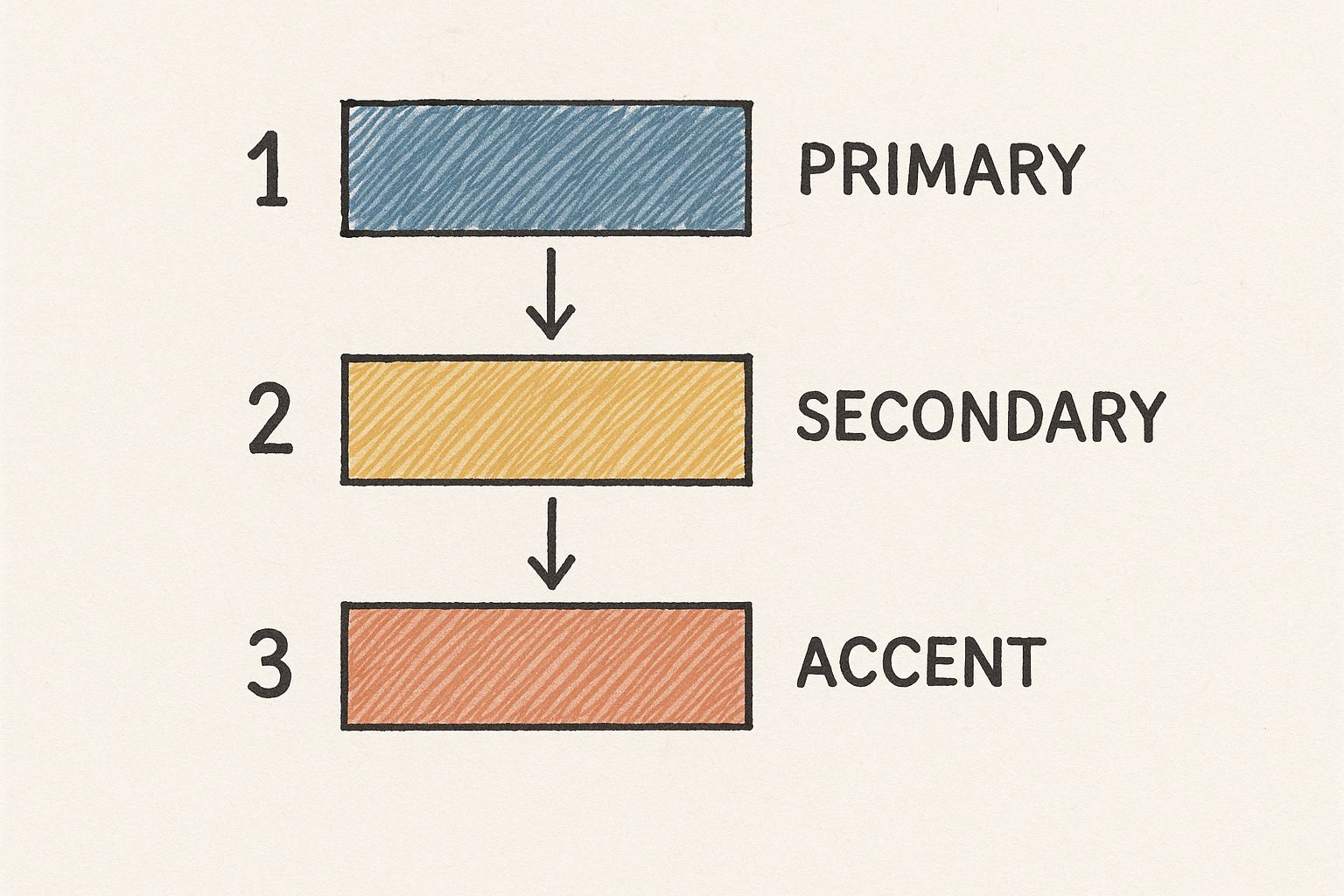
As you can see, it's all about how primary, secondary, and accent colors work together to create a system that's both consistent and flexible enough for all your communications.
Your palette should always include:
- Primary Colors: These are your 1-3 workhorse colors. They'll show up the most and form the core of your visual identity.
- Secondary Colors: Think of these 2-4 colors as your supporting cast. They complement the primary colors and are great for subheadings, call-out boxes, and graphics.
- Neutrals: You'll want a few shades of gray, beige, or off-white for backgrounds and long blocks of text.
Pro Tip: For every single color, provide the exact color codes for every possible use. That means HEX codes for the web, RGB values for digital screens (like presentations), and CMYK values for anything printed. This tiny technical detail is what ensures your school’s official blue looks the same on the website as it does on a printed progress report.
To help you organize this, here's a quick look at the core components you'll be defining.
Core Components of a Visual Identity Kit
This table summarizes the essential visual elements to define in your brand guidelines and what you need to consider for each one.
| Element | Key Considerations | Example Application |
|---|---|---|
| Logo | Clear space, minimum size, color variations, and misuse examples. | Ensuring the logo on a website header is legible and not crowded by other elements. |
| Color Palette | Primary, secondary, and neutral colors with specific HEX, RGB, and CMYK codes. | Using the primary blue for headlines and a secondary gold for accent lines in a brochure. |
| Typography | Font families, weights, and sizes for headlines, body text, and captions. | Setting the H1 website title in "Montserrat Bold" at 36px and body text in "Lato Regular" at 16px. |
Defining these elements clearly in your guide is the single best way to empower your team to create materials that look and feel professional every single time.
Build a Clear Typographic Hierarchy
If color sets the mood, typography is the voice of your brand made visible. A well-thought-out system of fonts creates a clear visual hierarchy, guiding the reader’s eye and making information much easier to absorb. This is a non-negotiable part of effective branding for education, where clarity is everything.
Start by selecting a primary font family and, if it makes sense for your brand, a secondary one. For each font, assign it a specific job.
For example:
- Headlines (H1, H2, H3): Use a bold, attention-grabbing font weight. This is the front door for your readers.
- Body Copy: Choose something clean and highly legible for longer paragraphs. Readability is king here.
- Captions and Labels: A lighter weight or smaller size works well for text that's important but doesn't need to shout.
Document the exact fonts, sizes, and weights for each application. This simple step prevents the free-for-all where every new flyer uses a different, wacky font, which makes your district's communications feel chaotic and unprofessional. This level of detail ensures everything from a superintendent’s letter to a social media graphic feels like it came from the same place.
Finding Your District's Voice and Tone

If your logo and colors are what your district looks like, then your brand voice is what it sounds like. It's the unique personality that should shine through in every single piece of communication—from a superintendent's formal letter to a fun Instagram post about a pep rally.
Getting this right is crucial. A consistent voice builds a sense of connection and trust, making your district feel less like an institution and more like a community of real people.
I've always found it helpful to distinguish between voice and tone. Think of it this way: your voice is your district's core personality, and it doesn't change. Your tone is the emotional inflection you use in different contexts. So, while your voice might always be supportive, your tone will shift to be reassuring during a weather-related school closure and celebratory when announcing a student scholarship.
From Vague Ideas to a Concrete Personality
Let's get practical. The first step is to nail down exactly what your voice is and, just as importantly, what it is not. Simply saying you want to be "friendly" isn't enough to guide your team. This is where a simple exercise can bring a ton of clarity.
I recommend using a "We are X, but not Y" framework. It forces you to define the edges of your brand personality.
- Confident, but not arrogant.
- Inspiring, but not preachy.
- Professional, but not stuffy.
- Knowledgeable, but not full of jargon.
- Warm, but not overly casual.
By setting these boundaries, you give everyone a simple gut check. Before hitting "publish" on a social post or sending out a newsletter, your team can ask: Does this sound more arrogant than confident? Is this language a bit stuffy? This simple framework is one of the most effective parts of any brand guide because people actually use it.
A brand voice isn't just a collection of nice-sounding words. It’s a direct reflection of your district's core values in written form. If a core value is "Community," your voice should sound inclusive, open, and welcoming.
When you get this alignment right, your communications will always feel authentic to who you are.
Bringing Your Voice to Life with Real-World Examples
All the theory in the world won't help if your team can't see how the voice works in the real world. This is where your brand guidelines need to become a practical toolkit, not just a document that sits on a shelf.
Show, don't just tell. I always include examples from a few common scenarios that every K-12 communicator deals with.
Scenario 1: A Crisis Communication Email to Parents
- Audience: Worried parents.
- Channel: Email/Text Alert.
- Voice: Authoritative, Calm, Empathetic.
- Example Message: "We are writing to inform you of a situation at Northwood High. All students are safe. Here are the facts we can confirm at this time…"
Scenario 2: An Instagram Post Celebrating Student Achievement
- Audience: Students, parents, and community members.
- Channel: Social Media.
- Voice: Enthusiastic, Proud, Genuine.
- Example Message: "Let's hear it for the robotics team! 🤖🏆 They brought home the state championship this weekend, and we couldn't be prouder of their hard work and creativity. Go Lions!"
Placing examples like these side-by-side really drives the point home, showing how the core voice adapts its tone without ever losing its fundamental personality.
Anchor Your Messaging with Core Pillars
Beyond just a personality, your voice needs something to say. This is where core messaging pillars come in. These are the 2-4 foundational themes, rooted in your district's mission, that you want to hit again and again. They are your "greatest hits."
For a typical K-12 district, these pillars might look something like this:
- Student-Centered Success: Every decision we make is guided by what’s best for our students' growth and well-being.
- Innovation in Education: We are committed to forward-thinking teaching methods that prepare students for the world of tomorrow.
- Strong Community Partnerships: We are better together, and we thrive by working hand-in-hand with our families and local organizations.
These pillars become a compass for your content. Does this blog post reinforce our focus on innovation? Does this video highlight a strong community partnership? Making sure every communication ties back to at least one pillar ensures your messaging stays focused, meaningful, and on-strategy.
Create a Quick "Use This, Not That" Glossary
One of the quickest wins for unifying your district's language is to create a simple glossary. Education is filled with internal jargon that can easily confuse parents and community members. A simple reference sheet empowers everyone, from the front office staff to department heads, to communicate with clarity.
I've found a simple table works best.
| Our Terms (Use These) | Terms to Avoid | Why It Matters |
|---|---|---|
| Learners, Students | Kids, Pupils | "Learners" is more inclusive and respects their active role. |
| Learning Environment | Classroom | Acknowledges that learning happens everywhere, not just in one room. |
| Family Engagement | Parental Involvement | "Family" is more inclusive of today's diverse family structures. |
| Post-Secondary Success | College-Bound | Acknowledges that a successful path can also include trade school, the military, or the workforce. |
This isn’t about being the "word police." It’s about being intentional. By making deliberate language choices, you ensure your communications truly reflect your district's values and are easily understood by everyone you serve.
Making Your Guidelines Usable with Templates & Resources
Let's be honest: even the most beautiful brand guide is useless if it just sits in a folder. The real magic happens when you make it incredibly easy for people to actually use the guidelines in their day-to-day work. The secret is to stop thinking about your guide as a rulebook and start thinking of it as a toolkit.
Your goal is to make doing things the "on-brand" way the path of least resistance.
A teacher creating a flyer for a bake sale shouldn't have to become a graphic designer overnight. They should have a simple, ready-to-go template that already has the right logo, fonts, and colors built in. This shift from enforcement to empowerment is everything. You're not just ensuring consistency; you're saving your colleagues a ton of time and stress.
Build a Go-To Template Library
Think about all the common things people create in your district. Your job is to make on-brand versions of them so no one ever has to start from a blank page again. This is where the rubber meets the road in getting your guidelines adopted.
Start with the essentials that will solve the most problems for the most people.
- Presentation Decks: Build a master template in both Google Slides and PowerPoint. Make sure it has various slide layouts—title slides, section breaks, photo-and-text pages—all pre-loaded with your brand fonts and colors.
- Social Media Graphics: Whip up a batch of simple, editable templates in a tool your team can actually use, like Canva or Adobe Express. Focus on common posts: event announcements, student spotlights, and "no school tomorrow" reminders.
- Official Letterhead: A simple digital Microsoft Word template for official communications is a must-have.
- Email Signatures: Design a standard signature and provide dead-simple, copy-and-paste instructions for getting it set up. People will thank you for this one.
Pro Tip: When you're building these templates, lock down the critical stuff like the logo and color palette, but keep the content areas completely flexible. This strikes the perfect balance—it gives your colleagues creative guardrails without stifling their message.
When the right way is also the easiest way, you'll see a dramatic improvement in brand consistency almost immediately.
Create a Central Hub for Brand Assets
Now, let's kill the "Hey, can you send me the logo?" email once and for all. You need a single, organized place where everyone can find the latest and greatest brand assets. This prevents well-meaning staff from grabbing a fuzzy, outdated logo from a Google Image search.
This hub can be a shared folder on Google Drive, Dropbox, or a dedicated digital asset management (DAM) platform if you have the budget. The tool matters less than the organization.
Structure your library so it’s completely intuitive.
- Logos: Have two main folders:
Print (CMYK)andWeb (RGB). Inside each, provide the logo in full-color, all-black, and all-white (knockout). Offer a few file types like PNG, JPG, and EPS to cover all bases. - Photography: Group approved photos into logical categories like
Events,Classrooms, andAthletics. And please, make sure you have photo releases for every person in every picture! - Icons and Graphics: If you have a custom icon set or other brand illustrations, this is where they live. Store them as high-quality vector files so they can be scaled without losing quality.
- Fonts: Licensing often prevents you from sharing the actual font files. Instead, include a document that links directly to where staff can download or activate the fonts, like Google Fonts.
A central library empowers everyone to be a brand ambassador. It stops brand chaos before it starts and gives your team the confidence and tools they need to represent your district well.
Keeping Your Brand Alive: Adoption and Governance
Creating a beautiful set of brand guidelines is a huge accomplishment, but let's be honest—the project isn't finished when you save the final PDF. The real test is whether your hard work actually gets used and sticks around for the long haul. Without a solid plan for rollout and governance, even the best guidelines will end up gathering digital dust on a server somewhere.
The launch is your moment to build momentum. This isn't about just sending a mass email with a "New Brand Guidelines!" subject line. It's about creating genuine understanding and buy-in across the district. True adoption happens when people see how these guidelines make their jobs easier, not harder.
Rolling Out Your Guidelines for Maximum Impact
Your rollout strategy needs to be just as thoughtful as the guidelines themselves. A phased, educational approach makes the new system feel like a helpful resource rather than a restrictive mandate. This is where clear, consistent communication from leadership is non-negotiable. For more on this, exploring strategies for effective communication for school leaders can give you some great ideas for getting your message across effectively.
Start by planning a series of short, engaging training workshops. Don't do a one-size-fits-all session. Target different groups with tailored content—what the front office staff needs to know is completely different from what the athletics department requires.
During these workshops, focus on the practical, "how-to" stuff:
- Demo the templates: Actually open the new Google Slides deck or Canva graphics and show them how to customize it.
- Walk through the asset library: Guide them directly to the correct logo and photo folders so they feel confident finding what they need later.
- Provide a "cheat sheet": Give them a simple one-page PDF that covers the absolute basics: the main logo, primary colors with HEX codes, and the go-to headline fonts.
This makes the guidelines feel accessible and immediately useful, which is key to getting everyone on board.
Building a System for Brand Governance
Once the initial launch buzz settles, your focus needs to shift to ongoing management. To avoid the inevitable "brand drift" where things slowly go off-course, you need a clear system of ownership and a process for keeping the guidelines current. A centralized management approach is incredibly effective here; it ensures consistency and streamlines efforts, much like a central dashboard does for managing multiple websites.
The first step is to designate a brand manager or a small committee. This person or group becomes the official go-to for any brand-related questions. They are the keepers of the flame, responsible for maintaining the asset library and approving any new materials that fall outside the standard templates.
Next, establish a simple review process. Things change. Your district might launch a new initiative that needs its own visual identity, or you might find that a certain rule is consistently causing confusion. Plan to review and update the guidelines on a regular schedule.
- Annual Review: A full, deep dive into the entire document to make sure it still aligns with the district's strategic goals.
- Quarterly Check-ins: Smaller reviews to address any recurring questions or requests that have popped up.
This proactive approach ensures your guidelines evolve with your organization and remain a living, relevant resource.
My Two Cents: Governance isn't about being the "brand police" and slapping people's hands. It's about providing ongoing support, answering questions, and making it simple for everyone to represent the district with pride and consistency.
Empowering Brand Champions Across the District
Let’s face it, you can't be everywhere at once. The most effective way to ensure long-term adoption is to cultivate a network of brand champions. These are your enthusiastic allies in different schools or departments who truly get why a consistent brand matters.
Look for people who are already creating great work or who show a keen interest in communications. Pull them aside and officially empower them to be the local brand expert for their team. They can answer simple questions, direct colleagues to the right resources, and be your eyes and ears on the ground.
This distributed ownership model embeds brand thinking directly into your district’s culture. When a teacher has a quick question about which font to use on a flyer, they can ask their department's brand champion down the hall instead of feeling lost. This network is what transforms brand consistency from a top-down directive into a shared, collaborative responsibility.
Answering Your Top Brand Guideline Questions
As you get into the nitty-gritty of building out your school's brand guidelines, some questions are bound to pop up again and again. You're not alone—these are common hurdles. Let's tackle some of the most frequent questions I hear from K-12 communicators.
Is This a Brand Guide or a Style Guide?
It's really easy to get these terms mixed up, but they actually have distinct jobs. Think of a style guide as the tactical rulebook. It’s all about the design specifics: which logo to use, what the exact color codes are, and which fonts are approved. It answers the "how-to" for keeping your look consistent.
A brand guide is the whole story. It contains everything you'd find in a style guide, but it also explains the strategic "why" behind those choices. It covers your mission, your core values, and the principles that shape your voice and tone. It gives people the context they need to communicate in a way that’s truly on-brand.
A style guide says, "Use this font." A brand guide says, "Use this font because it makes our district feel modern and accessible to new families."
Should We Build This In-House or Hire an Agency?
This is a big one. The decision to create your guidelines internally or bring in an agency really depends on your resources and expertise.
Doing it in-house is usually easier on the budget, and you can be sure the final product is a genuine reflection of your school's culture. The catch? It demands a huge amount of time and requires someone on your team to have the right skills.
Hiring an agency gets you a fresh, outside perspective, professional design talent, and someone to manage the whole project. This is a game-changer if your team is already swamped or doesn't have deep branding experience. Of course, this route costs more, and you'll need to invest time in getting the agency up to speed on your district’s unique culture. This choice often connects directly to a school's larger goals around what is enrollment management, because a powerful brand is key to attracting students.
How Can We Get Our Staff to Actually Use This?
Honestly, this might be the toughest part. Just emailing out a PDF and hoping for the best is a recipe for failure. Getting buy-in from staff—especially those who are used to their old ways of doing things—is all about empowerment, not enforcement.
- Make it easy. Frame the guidelines as a toolkit that makes their jobs simpler. Host hands-on training workshops that show people how to use the new templates and find the resources they need.
- Find your champions. Identify enthusiastic staff members in different buildings or departments who can serve as local brand advocates and go-to guides for their colleagues.
- Focus on the "why." When you show people how a unified brand helps the entire district shine, they're much more likely to see it as a valuable asset rather than a restrictive rulebook.
Ready to connect with other K-12 marketing pros who are tackling the same challenges you are? The MarCom Society is a professional community where you can collaborate, learn from experts, and access resources to make your job easier. Join us at https://marcomsociety.org to elevate your school's communications strategy.