A style guide is your school’s personality, captured in a single, accessible document. It’s where you define everything from your visual look to your written voice. Think of it less as a rigid rulebook and more as a strategic framework that ensures every single piece of communication feels authentically yours. This consistency is what builds real, lasting trust with your community.
Why a Style Guide Is Your Brand’s North Star

Before we get into the nitty-gritty of fonts and logos, let’s talk about why a style guide is absolutely non-negotiable for any school serious about its brand. It’s basically the DNA of your school's identity. This guide is what makes sure every tweet, email, and prospectus feels like it came from the same trusted place.
Without one, things can get messy, fast. Imagine a new marketing hire using the wrong shade of blue on a social media post, or a freelance writer adopting a tone that feels completely out of step with your school’s core values. These little inconsistencies seem small, but they slowly chip away at brand recognition and trust.
A good style guide prevents this chaos. It empowers everyone—from the admissions team to the development office—to communicate with one clear, unified voice.
Fostering Consistency and Building Trust
Consistency is the absolute bedrock of a strong brand. When prospective families see the same colors, logos, and messaging style over and over, it builds a powerful sense of familiarity. That familiarity is what creates trust—a critical factor when they’re making one of the most important decisions for their children.
The numbers don't lie. One recent report found that 81% of consumers need to trust a brand before buying from them. And get this: a massive 55% of brand impressions are shaped by visual elements alone. Your style guide puts you in direct control of those impressions.
A style guide doesn’t just tell people what to do; it shows them how to think like your brand. It turns subjective creative decisions into objective, strategic choices that anyone on your team can make with confidence.
This single document becomes the guiding light for your brand, ensuring every decision and communication aligns perfectly with your school's core identity.
Speeding Up Creative Workflows
Beyond protecting your brand’s integrity, a style guide has huge practical benefits. Just think about the time you'll save when a designer doesn’t have to hunt down a hex code or a writer knows the exact tone to strike for a blog post. It cuts out the guesswork and eliminates the endless back-and-forth on creative approvals.
For school marketing teams juggling a dozen different projects, that kind of efficiency is priceless. It helps you produce better work, faster, so your team can focus on big-picture strategy instead of getting bogged down in minor details. Onboarding new team members or working with outside agencies also becomes a much smoother process.
To fully appreciate how your brand presents itself, it helps to understand why a business needs professional photos. After all, high-quality visuals are a cornerstone of how people perceive you, and your style guide will define exactly how to use them effectively.
Getting to the Heart of Your School's Brand
Before you even think about picking out fonts or debating color swatches, we need to pour the foundation. A style guide without a solid brand strategy underneath is just a rulebook with no real purpose. This is the crucial first step where you get crystal clear on who you are, who you're talking to, and what makes your school the only choice for them.
Think of it as defining your school's personality. Without that, all the design elements in the world are just window dressing. Once you know your core principles, every other decision—from your website's headline to the tone of a social media post—falls into place so much more easily.
Nail Down Your Mission, Vision, and Values
Let's be honest, that mission statement plaque in the front office isn't enough. For this to work, your mission, vision, and values have to be living, breathing principles that actually drive your marketing decisions. Your mission is what you do every day, your vision is the future you're building, and your values are the non-negotiables that guide you.
Get your leadership team, admissions staff, and even a few trusted teachers in a room and start asking the tough questions:
- Why do we really exist? Beyond just educating kids, what problem do we solve for families?
- If we fast-forward 10 years and we’ve knocked it out of the park, what does our school community look like? This is the heart of your vision.
- What are the 3-5 words that absolutely must describe our culture? These will become your core values.
Getting these answers on paper gives you the strategic "why" behind every single rule in your style guide. For instance, if "innovation" is a core value, your guide will naturally lean toward a clean, modern aesthetic instead of something more traditional.
Get to Know Your Audience on a Deeper Level
You can’t have a meaningful conversation if you don't know who you're talking to. This is why building out detailed audience personas is one of the most valuable things you can do when learning how to create a style guide. These aren’t just dry demographic data points; they're detailed profiles of the real people you serve.
Don't just stop at "parents, age 35-50, with a household income of X." That's surface-level stuff. You need to understand their hopes, their anxieties, and what truly motivates them when choosing a school.
Meet "Prospective Parent Paula":
- Who she is: Paula is a busy working mom with two kids, 6 and 9. She's looking for a new school because their current one feels impersonal and her kids are getting lost in the shuffle.
- What she wants: She’s looking for a place that offers strong academics but also cares about her children's creativity and emotional growth. A real sense of community is a huge selling point for her.
- Her pain points: Time is her most precious commodity. She's overwhelmed by all the options and needs clear, direct communication that addresses her fears about class size and teacher-student relationships.
- Where to find her: She trusts what other parents say on online forums, she pores over school websites looking for genuine testimonials, and she’s drawn to authentic, visual content on social media.
When you have a crystal-clear picture of Paula, you can shape your brand voice and visual style to connect with her directly. Your style guide then becomes a tool to ensure everyone on your team is speaking her language.
Your brand foundation isn't just for an internal binder. It’s the source code for building real relationships with your audience, making sure every flyer, email, and ad feels like a personal conversation with someone who gets it.
Pinpoint What Makes You a One-of-a-Kind Choice
Last but certainly not least, you have to nail down what makes your school truly unique. In a sea of options, what’s your special sauce? This is your unique value proposition (UVP), and it’s the one powerful idea you can own that no one else can.
Maybe it's your incredible project-based STEM program, a deep-rooted commitment to service learning, or an arts curriculum that’s second to none. Whatever it is, that idea has to be the central thread woven throughout your style guide.
To figure it out, try this simple exercise:
- Who’s the competition? List your top 3 competitors and what they're famous for.
- What are we great at? Make an honest list of your school’s biggest strengths.
- Find the overlap. Where does your strength meet a real need that your competitors aren't addressing?
That sweet spot is your unique brand position. This core concept will dictate everything from your key marketing messages to the style of photography you use. With this solid foundation in place—your mission, your audience, and your unique position—you're finally ready to build the visual and verbal identity that brings it all to life.
Building Your Visual Identity System
This is where your school's brand stops being an abstract idea and starts taking on a real, visible form. Creating a style guide is all about translating your school's personality into a consistent visual language that your entire team can understand and, most importantly, use correctly. Let’s walk through how to document the core components: your logo, colors, typography, and imagery.
Think of these elements as the essential DNA of your brand recognition. When you use them consistently, you create a seamless look and feel everywhere—from your website's homepage to the invitations for the annual fundraising gala. That consistency is what makes your school instantly recognizable and builds a powerful sense of trust within your community.
Your Logo Is More Than Just a Mark
Your logo is the single most concentrated expression of your school's brand, so it needs ironclad rules to protect its integrity. Start by defining the primary version—the one you'll be using 90% of the time. From there, you'll want to document every acceptable variation, like a one-color version that works on tricky backgrounds or a simplified icon that fits perfectly in a social media profile picture.
Next, you have to establish some non-negotiable rules for how it can be used. This is what stops well-meaning staff members from accidentally stretching, squashing, or recoloring your logo in a way that dilutes its power.
- Clear Space: Mandate a "safe zone" or buffer of empty space around the logo. This ensures it never looks cramped or crowded. A great rule of thumb is to use the height of a key element within the logo, like the first letter of the school's name, as the measurement for this buffer.
- Minimum Size: You need to define the absolute smallest the logo can be shown in print and on a screen before it turns into an unreadable smudge. This is incredibly important for things like email signatures or favicons.
- Common Misuses: Don't just tell people what not to do—show them. Create a quick visual guide of "don'ts," like placing the logo on a busy, patterned background, altering its official colors, or adding a cheesy drop shadow.
This visual guide shows how these core elements—logo, color, and typography—come together to form a cohesive brand mood board.

As you can see, a strong visual system isn't about having a ton of different elements. It's about having the right ones working together in harmony.
To keep track of everything, a simple checklist can be a lifesaver. It ensures you’ve covered all your bases when defining your visual identity.
Core Visual Identity Checklist
This table serves as a quick reference to make sure you've defined and included every essential visual element in your style guide.
| Visual Element | Key Considerations | Example Specification |
|---|---|---|
| Logo | Primary, secondary, icon versions, clear space, minimum size, misuse examples. | "Clear space is equal to the height of the 'W' in our wordmark. Minimum digital size is 50px wide." |
| Color Palette | Primary, secondary, and accent colors defined. HEX, RGB, CMYK codes for all. | "Primary Blue: HEX #003366, CMYK (100, 80, 0, 55). Used for headlines and core branding." |
| Typography | Font families for headlines and body text. Hierarchy rules (H1, H2, body). | "Headlines: Poppins Bold, 32pt. Body Text: Lora Regular, 16pt. Never use more than 2 fonts." |
| Imagery | Photo style (candid, posed), color treatment (vibrant, muted), illustration style. | "All photography should feature natural light and authentic student interactions. Avoid stock photos." |
By checking off each of these items, you build a comprehensive and easy-to-follow guide that leaves no room for brand inconsistency.
Building a Purposeful Color Palette
Color is pure emotion. It’s one of the fastest ways to communicate a feeling. Your style guide needs to establish a purposeful color palette that not only reflects your school's personality but also ensures your communications are clear and accessible. Don't just pick a few colors you happen to like; build a system where each color has a job.
Your palette really just needs three components:
- Primary Colors: These are the one or two heavy lifters of your brand identity. They should show up most often and be the most prominent.
- Secondary Colors: Think of these as the supporting cast. They complement your primary colors and are great for accents, subheadings, or breaking up sections of a design.
- Accent Colors: Use these sparingly. They're the exclamation points in your palette, perfect for calls-to-action, important highlights, or special announcements.
For every single color, provide the exact codes for every possible use case: HEX for the web, RGB for digital screens, and CMYK for anything printed. This takes all the guesswork out of the equation and guarantees perfect color matching, every single time.
Demystifying Typography
Believe it or not, your font choices say a lot about your school. Are you traditional and established? Or are you modern and forward-thinking? Your guide should specify two, maybe three, font families at most to keep your look clean and uncluttered.
The key is to create a clear visual hierarchy by assigning specific fonts, sizes, and weights to different text elements. It's simpler than it sounds.
- Headlines (H1, H2, H3): This is usually a bold, distinct font that grabs the reader's attention.
- Body Text: Choose a clean, highly readable font for longer paragraphs. Legibility is everything here.
- Captions & Labels: A smaller, often lighter-weight font works well for supplementary information.
This hierarchy does the work of guiding the reader's eye, making your content easy to scan and digest. Nailing down these rules is an essential part of creating a style guide that keeps your documents and digital platforms looking polished and professional.
Setting Guidelines for Imagery
Your photos and illustrations are where your brand’s story really comes alive. Clear imagery guidelines ensure that every visual asset you use feels like it belongs to the same family. This is about more than just using high-quality photos; it’s about defining a specific aesthetic.
Think about the way younger generations interact with brands. With 22% of Gen Z now using visual search to find and buy products, having a distinct and consistent visual language is more important than ever. Your photos need to tell a story that resonates. You can dive deeper into creating compelling narratives with our guide on visual storytelling techniques.
Ultimately, your style guide should provide clear directions for how your brand looks everywhere, from social media posts to the various commercial signs to elevate your brand around campus. It's all about making sure your school looks like itself, no matter where people encounter it.
Finding Your Authentic Brand Voice
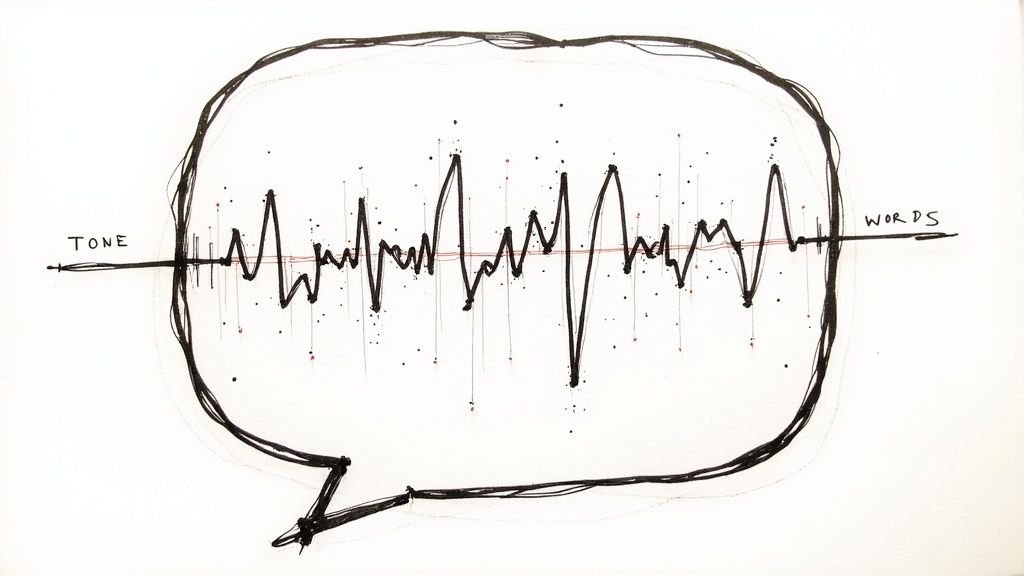
If your school's visual identity is how it looks, then your brand voice is how it sounds. It’s the distinct personality that shines through in every prospectus, social media post, and parent email. Get this right, and you build a real connection that visuals alone can't touch.
This isn’t about picking a few generic adjectives like "friendly" or "professional." To create a guide that your team will actually use, you have to go deeper. The real goal is to develop a verbal identity so consistent that your community would recognize it anywhere, even if your logo wasn't there.
Go Beyond Vague Adjectives
Just saying your brand voice is "friendly" doesn't give a writer much to work with. Think about it: your best friend is friendly, but so is the cashier at the supermarket. They don't sound the same. The trick is to move from broad terms to a spectrum of specific personality traits.
I find the best way to do this is with a simple "This, Not That" framework. This exercise forces you to make clear, deliberate choices that give your team concrete direction.
Here’s what that looks like:
- We are: Confident, not arrogant.
- We are: Inspiring, not preachy.
- We are: Playful, not silly.
- We are: Knowledgeable, not stuffy.
This simple chart immediately clarifies things. A writer now knows "confident" means using direct, assured language, while steering clear of the boastful or dismissive tone that would drift into "arrogant."
Pinpoint Your Core Vocabulary
With your personality traits locked in, you can start building a unique vocabulary to match. This comes down to creating two lists: words we use and words we avoid. It’s a wonderfully practical tool for keeping everyone on the same page.
Imagine a school that prides itself on innovation. Their lists might look something like this:
Words We Use:
- Explore
- Discover
- Create
- Collaborate
- Launch
Words We Avoid:
- Traditional
- Standard
- Mandatory
- Lecture
- System
These lists become a quick-check resource, especially for new team members or freelance writers. They ensure the messaging always echoes your school's core values. For a closer look at the strategy behind word choice, the principles of copywriting for education are a fantastic resource.
Voice vs. Tone: Know The Difference
This is a point of confusion for so many teams, so it’s critical that your style guide makes the distinction crystal clear.
Your voice is your brand’s fixed personality—it doesn’t change. Your tone is the emotional inflection that adapts to different situations.
Think of it this way: You have one core personality (your voice). But you don't speak to your best friend the same way you speak to your boss (your tone). The essential you is always there, but your delivery shifts.
Your brand works the exact same way. The voice—let's say it's "passionate and encouraging"—is constant. The tone, however, needs to be flexible.
- Celebrating a student's award on Instagram? Your tone should be celebratory and full of energy, maybe with some emojis and exclamation points.
- Explaining the admissions process on your website? The tone shifts to be helpful, clear, and reassuring, using simple language.
- Addressing a serious community issue in an email? Here, the tone must be empathetic, direct, and sober, with no hint of casualness.
A great style guide gives examples of how to modulate tone for different channels and scenarios. This empowers your team to communicate effectively while always sounding like you.
Get Into the Grammatical Nitty-Gritty
Finally, a truly practical brand voice section has to cover the small stuff: grammar, punctuation, and formatting. These might seem like minor details, but they are the absolute bedrock of consistency. Deciding on these rules now will save you from endless debates and edits down the road.
Your guide should provide a final verdict on common editorial questions:
- Punctuation: Do we use the Oxford comma? (The answer should be yes or no, not "sometimes.")
- Headlines: Are they written in Title Case or sentence case?
- Numbers: Do we spell out numbers one through nine and use numerals for 10 and up?
- Acronyms: After spelling out the full school name, is the acronym acceptable on second reference?
Documenting these rules removes all ambiguity. It ensures every piece of writing that leaves your office is polished, professional, and perfectly on-brand.
Bringing Your Style Guide to Life
You’ve put in the hard work. You’ve defined your school’s core identity, built a visual system, and captured its authentic voice. But here’s the tough truth: a style guide is completely useless if it just sits in a shared drive, collecting digital dust.
The final—and most important—step is bringing that document to life within your school's culture. This isn't just about creating rules; it's about making consistency the easiest path for everyone, from your internal team to freelance partners and agencies. Your guide needs to be a practical, accessible tool, not some sacred text locked away in an office.
Choosing the Right Format for Your Guide
How you package your style guide has a massive impact on whether it actually gets used. A simple PDF is a decent start, but its static nature means it can feel outdated almost as soon as you export it. For your guide to be truly effective, it has to be effortless to access, search, and share.
Think about these more modern, usable formats:
- An Interactive Website or Intranet Page: This is really the gold standard. A dedicated webpage is searchable, incredibly easy to update, and lets you embed things like videos or link directly to asset libraries. Finding a specific hex code or the right logo file becomes a one-click process instead of a frustrating search.
- A Cloud-Based Document: Using a tool like Google Docs or Notion is a huge step up from a PDF. It allows for real-time collaboration and updates. You can share a single link with anyone who needs it, confident they always have the most current version.
- A Brand Asset Management (BAM) Platform: If you're part of a larger team, dedicated software like Frontify or Bynder is a game-changer. These platforms house your style guide right alongside all your brand assets, creating a single source of truth for everything from logos to official photography.
A great style guide isn't just a document; it's a resource. Whatever format you choose, make it so simple to use that people have no excuse not to check it. Accessibility is the key to adoption.
Launching and Embedding the Guide
Just sending out an email with a "please read this" subject line is a recipe for failure. If you want real buy-in, you need to launch it with a bit of fanfare. Host a short, engaging training session—maybe a "Lunch & Learn"—to walk your entire team through the document.
Show them why it matters and, more importantly, how it makes their jobs easier. Focus on the practical benefits, like getting design work approved faster or writing clearer communications.
This consistency is more critical than ever. Recent research shows the average social media user engages with about 6.83 different platforms each month. In such a fragmented world, a coherent brand identity is the only way to stand out and be recognized.
From there, it's all about making the guide a part of your daily workflow.
- Integrate it into the onboarding process for every new hire.
- Include a link to the guide in all your project briefs and creative requests.
- Designate a "brand champion" on your team—someone who can answer questions and gently correct misuses.
This isn't about enforcing rules from on high; it's about creating a shared culture of brand consistency. For a deeper look at this process, check out our complete walkthrough on how to create brand guidelines.
Keeping Your Style Guide a Living Document
Your school is going to evolve, and your style guide has to evolve with it. Think of it not as a one-and-done project but as a living document that needs regular care and attention to stay useful.
Set a simple schedule for check-ins. Plan for a full, formal review at least once a year to make sure the guidelines still align with your school's strategic goals. Minor updates, however, should happen as soon as they're needed. Did you launch a new academic program? Add a new social media channel? Refresh your mission statement? Update the guide immediately.
This proactive approach ensures your brand standards never fall out of sync with your school's reality. It keeps your communications sharp, cohesive, and perfectly aligned with who you are today—and who you're striving to become tomorrow.
Got Questions About Style Guides? We've Got Answers.
Even with the best instructions, you're bound to hit a few roadblocks or have questions pop up. It happens every time. This is where we’ll tackle some of the most common questions that come up when schools start digging into their brand and building out a style guide.
How Long Does This Actually Take to Create?
The honest answer? It depends. The timeline for creating a style guide can vary wildly based on your school's size and the complexity you're aiming for.
A small, agile school might be able to hammer out a solid one-page guide with the essentials in about a week. On the other hand, a larger university with multiple departments could easily spend several months creating a truly comprehensive document that covers every possible scenario.
The key is to just get started.
Don't let the quest for the perfect, all-inclusive guide stop you from creating a good enough one. A simple guide that people actually use is infinitely better than a flawless one that's perpetually "in progress."
Nail down your core elements first—logo rules, primary colors, and basic typography. You can always expand on it later as your needs evolve.
What's the Difference Between a Brand Book and a Style Guide?
You'll often hear these terms used interchangeably, but there's a real distinction between them. It helps to think of it like this:
- A style guide is your tactical playbook. It's the practical, "how-to" manual your team uses every single day to apply brand elements correctly.
- A brand book is the strategic, "why" document. It dives deeper into your school’s mission, vision, core values, and overall market positioning, and then includes the style guide within it.
For the day-to-day grind of marketing and communications, a well-defined style guide is exactly what your team needs to keep things consistent.
How Often Should We Update Our Style Guide?
Think of your style guide as a living document, not something you create once and file away forever. It needs to breathe.
Plan on a formal review at least once a year. This gives you a dedicated time to make sure everything still feels relevant and aligns with your school's goals. A lot can shift in twelve months, and you want your brand to keep up.
Beyond that annual check-up, you’ll want to make updates whenever a significant change happens. That could be anything from:
- Launching a new signature program.
- Joining a new social media platform that has its own unique rules.
- Refreshing your school's tagline or core messaging.
Keeping your guide current is what makes it a genuinely useful tool instead of just another document collecting digital dust.
Does a One-Person Marketing Shop Really Need a Style Guide?
100% yes. If you're a solopreneur or a tiny marketing team, a style guide isn't a "nice-to-have"—it's a massive time-saver and a shortcut to looking professional.
It's all about eliminating decision fatigue. You're no longer staring at a blank canvas wondering which hex code or font to use for a quick social media graphic.
By making those decisions ahead of time, you create a consistent, recognizable brand presence from the very beginning. It helps a small school look established, polished, and trustworthy, which is a huge advantage when you're trying to build a strong foundation without a big team.
At The MarCom Society, we're dedicated to giving school marketing professionals the tools, resources, and community they need to build incredible brands. Join us for access to expert-led workshops, practical templates, and a network of peers who just get it.
Ready to elevate your school's marketing? Join our community today.