Why Your School's Digital Front Door Makes or Breaks Success
Imagine a parent searching for the right school. It's late, they're online, and they're scrolling through website after website. Your school's site is in the mix, hoping to stand out and become their child's educational home. In this crucial moment, your website – your digital front door – can either welcome them in or gently nudge them away. It's not just about having a website; it's about having one that truly resonates.
This goes beyond simply looking good. It's about understanding the psychology of how parents evaluate schools online. Think about walking into a physical building: you form an immediate impression. Is it welcoming? Organized? Does it reflect the values it promotes? Your website evokes the same reaction, only online, that first impression happens in a fraction of a second.
Just how quickly are these opinions formed? Research shows it takes a mere 0.05 seconds for someone to judge a webpage's quality and trustworthiness. Your homepage needs to be visually appealing and professional from the get-go. In fact, 38% of users will leave if the design is unattractive, and 47% will abandon a site that takes too long to load (more than two seconds). Appearance and performance are key to grabbing – and keeping – a visitor’s attention. Discover more insights into higher education website design.
The Power of First Impressions
Let's talk about the impact of those first impressions. What happens if a parent can't find the information they need? They might assume the school itself is disorganized. If the site looks outdated, they might question the school's commitment to modern learning. These snap judgments can seriously impact enrollment and community perception. To illustrate this further, take a look at the table below:
First Impression Impact Metrics for Education Websites
| Metric | Timeframe | Impact | User Behavior |
|---|---|---|---|
| Visual Appeal | 0.05 seconds | Forms initial impression of credibility | Stays or leaves based on aesthetics |
| Page Load Speed | 2 seconds | Determines engagement | Abandons site if too slow |
| Navigation | < 30 seconds | Influences perceived organization | Frustration if information is hard to find |
| Content Quality | < 1 minute | Shapes perception of educational approach | Engages further or leaves based on relevance |
These metrics highlight how quickly judgments are formed and the consequences of a poor user experience. A visually appealing, fast-loading site with clear navigation is essential for holding a visitor's attention and encouraging them to explore further.
Beyond the Surface
Effective school website design is more than just a pretty face. It's about strategically crafting an online experience that speaks to your audience. This involves understanding their needs, anticipating their questions, and presenting information in a way that’s easy to understand and engaging.
Building trust is another critical piece of the puzzle. Just as a cluttered, dimly lit building might feel unsafe, a poorly designed website can erode confidence. Parents are entrusting their children's education to you, and your website should reflect the importance of that responsibility.
In the following sections, we'll dive deeper into the specific elements of effective education website design, giving you practical advice on how to create a digital front door that welcomes families, builds trust, and ultimately, helps your school thrive.
Building Trust Through Design That Actually Connects
Think about visiting two different schools. One feels chaotic and unwelcoming. The other immediately gives you a sense of order, professionalism, and care. Your website can create those same feelings, but online, first impressions are formed in a flash.
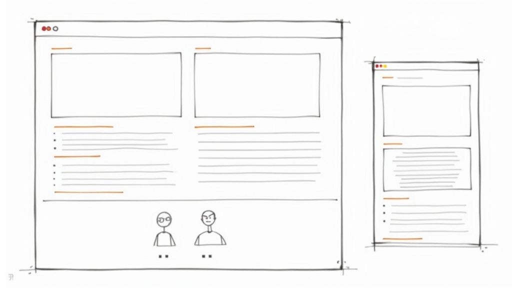
This section explores how to build trust through effective education website design. We'll look at how successful schools communicate their values visually, before a parent even starts reading.
Visual Cues That Speak Volumes
Let’s start with color. A soothing blue might suggest stability, while a bright orange might convey energy. Neither is right or wrong, but the choice should match your school’s identity and who you're trying to reach. The pictures you choose also send a message. Authentic photos of students engaged in learning build confidence, while generic stock photos can feel impersonal and even make people suspicious.
Even small details like fonts and layout add to (or detract from) your credibility. Imagine a website with clashing colors, disorganized content, and blurry photos. It unintentionally says, “We don’t pay attention to detail.” This might make parents question the school's overall quality.
On the other hand, a clean, professional design with high-quality images and a clear message builds confidence and encourages visitors to explore. This is true for all types of schools – private, charter, and public. Good design means understanding the specific needs and expectations of your audience.
Learning From Success Stories
Many schools have seen enrollment jump after focusing on trust-building design. One school updated their site with professional photos of their diverse student body actively learning. They simplified navigation so parents could easily find information about programs and admissions. The result? A 15% increase in inquiries and a significant boost in applications. These weren't just cosmetic changes; they demonstrated an understanding of how parents evaluate schools online. You might be interested in: Public Relations for Schools.
Another school, struggling with declining enrollment, redesigned their site to emphasize community. They included student and teacher stories, sharing their experiences and successes. They also added a blog with updates on school events and activities. This genuine, community-focused content rebuilt trust, leading to a 10% increase in enrollment the following year.
Evaluating Your Current Design
Now, take a close look at your school’s website. Does it project the image you want? Does it inspire confidence and encourage engagement? Ask yourself these questions:
- Does the color palette reflect your school’s brand and values?
- Are the images high-quality, authentic, and representative of your community?
- Is the navigation clear and easy to use?
- Does the content feel genuine and informative?
- Does the overall design inspire trust and encourage families to learn more?
By viewing your current design through this lens of trust-building, you can identify ways to improve and create a digital experience that truly reflects your school’s mission and connects with your audience. This thoughtful approach to website design is a direct investment in your school's future.
Creating Mobile Experiences That Actually Work For Busy Families

Imagine a parent juggling work, kids, and everything in between. When are they likely to research your school? Probably during those snatched moments – waiting for soccer practice to end, on their lunch break, or after the kids are finally asleep. This is the reality of how families interact with school websites today.
Many school websites, however, are built with desktops in mind, then shrunk down for mobile. This creates a cramped, frustrating experience for users. Instead, imagine designing your website specifically for mobile, putting the information busy parents need right at their fingertips.
Mobile-First Design: A Shift in Perspective
Mobile-first design isn't about squeezing your desktop site onto a smaller screen. It's a whole new way of thinking. It means designing for the "thumb-scrolling" parent, creating an experience that's smooth and intuitive on any mobile device.
This means prioritizing essential information. Think about what parents need on the go: contact details, school hours, upcoming events. These should be easy to find. Navigation needs to be simple. Can a parent find what they're looking for in 30 seconds? If not, streamline your menus and make them easy to tap.
Also, remember the range of devices out there. Your website should work perfectly on iPhones, Android phones, and tablets. Responsive design is key here, ensuring your content adapts to any screen size. In fact, responsive design is now the standard, with 90% of all websites – about 1.2 billion globally – using this approach. This makes websites more accessible and inclusive for everyone. Discover more insights into website statistics.
Real-World Success Stories
Schools that have adopted mobile-first design have seen real improvements in parent engagement. One school district saw a 40% increase in mobile traffic after simplifying navigation and prioritizing key information. Another school boosted parent event registrations by 25% simply by making the registration process mobile-friendly. These results show the real impact of putting mobile first.
One crucial element in building trust is showcasing social proof. Learning how to add Google reviews to website can greatly improve your school's online credibility.
Transforming Mobile From Afterthought to Advantage
Mobile-first design is about removing the obstacles between your school and the families you serve. It's about delivering information in a way that works for their busy schedules, ultimately building a stronger connection with your community. By prioritizing mobile, you're not just creating a website; you're creating a more connected and accessible school community.
Navigation That Thinks Like Your Community Actually Thinks
Picture this: a worried parent at 5:30 AM, scrambling to find out if school is closed because of snow. Or a new teacher, quickly searching for district policies during their lunch break. In these high-pressure moments, your website’s navigation is everything. It’s either a helpful tool or a major roadblock. Traditional school websites often organize information by department – the way the school thinks. But that's not how people think, especially when they're stressed.
Task-Based Navigation: Designing for How People Search
Effective school websites anticipate these urgent needs. Instead of a department-focused structure, imagine building around task-based navigation. Think of it like organizing a toolbox: you wouldn’t put all the screwdrivers in one drawer, the hammers in another, and the wrenches in a third. You'd group tools based on the jobs they do, like hanging a picture or fixing a leaky faucet. Similarly, organize your website around what users want to do. For example, instead of hiding "School Closings" deep within a "District News" section, feature it prominently on the homepage.
Consider the most common reasons people visit your site:
- Checking school closures or delays
- Accessing lunch menus
- Finding staff contact information
- Paying school fees
- Applying for enrollment
Make these key tasks easy to find by using clear, simple labels. A parent shouldn't need a treasure map to find vital information.
Progressive Disclosure: Unfolding Information Like a Story
Another smart tactic is progressive disclosure. This means revealing information in layers, showing only what’s relevant at each step. Think of it like a choose-your-own-adventure book. You start with a simple choice, and each decision leads to a new set of options. Imagine a parent searching for after-school programs. Instead of bombarding them with every program detail at once, start with a top-level navigation link like "After-School Activities." Clicking this then reveals sub-options like "Sports," "Arts," and "Academic Enrichment."
This approach keeps the navigation tidy and focused, allowing users to delve deeper when they need more specific information. It’s like browsing a well-organized library: you begin with broad categories and gradually narrow your focus.
Search Functionality That Actually Works
Even with top-notch navigation, a robust search bar is a must-have. Many school websites have search functions that are about as helpful as a broken compass. Invest in a strong search tool that can handle misspellings, different phrasing, and even understands the way parents typically ask questions. If someone searches "snow day," it should yield the same results as "school closure" or "weather delay."
Validating Your Navigation: Testing With Real People
Before launching any new navigation structure, test it out with your target audience. Think of it like a test drive for your website. Conduct user testing with parents, teachers, and students. Observe how they move through the site and identify any stumbling blocks. Ask them to perform specific tasks, such as finding the school calendar or registering for a parent-teacher conference. This real-world feedback is incredibly valuable for fine-tuning your design and ensuring it actually serves your community. You can learn more about effective content marketing for schools. This method of testing and refining your education website design will result in a more user-friendly and effective online experience for everyone.
Content Strategy That Builds Genuine Community Connection
The best school websites do more than just present facts; they create a sense of belonging. They showcase the special, everyday moments that make a school unique, celebrate student achievements authentically, and help families picture their children thriving in that environment. Think of it this way: a school website should feel less like a brochure and more like a welcoming invitation into the school community.
Balancing Promotion and Authenticity
Effective schools understand the fine line between highlighting their strengths and staying genuinely connected with their audience. It's not about bragging, it's about telling a story. Imagine two schools: one plasters its website with generic declarations of "excellence," while the other shares specific stories of student projects, exciting teacher initiatives, and lively community events. Which one feels more real, more welcoming?
This storytelling approach resonates with families because it speaks to our shared desire for connection. Authenticity builds trust, and trust forms the bedrock of any strong school-community relationship. For more ways to strengthen your school’s online presence, check out our guide on SEO for education websites.
Engaging Your Community in Content Creation
Creating compelling content doesn't have to be a burden solely on the marketing team's shoulders. Imagine the richness and authenticity you could achieve by involving teachers and students! Teachers could become content creators, sharing glimpses into their classrooms through short blog posts or quick video clips. Students could contribute artwork, summaries of exciting projects, or even write articles for the school blog.
This collaborative approach not only eases the workload for the marketing team but also fosters a shared sense of pride and ownership within the school community.
Showcasing Achievement Without Intimidation
Celebrating student success is crucial, but it's important to do so in a way that inspires and includes, rather than intimidates or excludes. Instead of simply listing awards and achievements, share the stories behind them. Highlight the dedication, hard work, and teamwork that led to those successes.
For instance, rather than just announcing that the debate team won a regional competition, share their journey. Showcase their preparation, their challenges, and the unique contributions of each team member. This approach not only celebrates achievement but also presents relatable role models for other students.
Maintaining Fresh and Relevant Content
To keep your website engaging and relevant, you need a consistent content strategy. Think of your website as a living entity, reflecting the vibrant energy of your school. Regularly refresh your blog with news, events, and stories from the classroom. Feature student artwork, exciting project highlights, and profiles of inspiring teachers.
This ongoing effort not only keeps your content fresh but also shows your commitment to open communication and transparency. By embracing a genuine, community-focused approach to content creation, you can transform your education website from a static source of information into a dynamic hub of connection and belonging.
Leveraging Modern Technology For More Human Connections
It's a curious thing: in education, the best technology actually makes things feel more human. Think of it like a well-placed bridge, connecting people rather than creating distance. Forward-thinking schools are using tools like AI and thoughtful web design to remove barriers and foster stronger relationships with their communities.
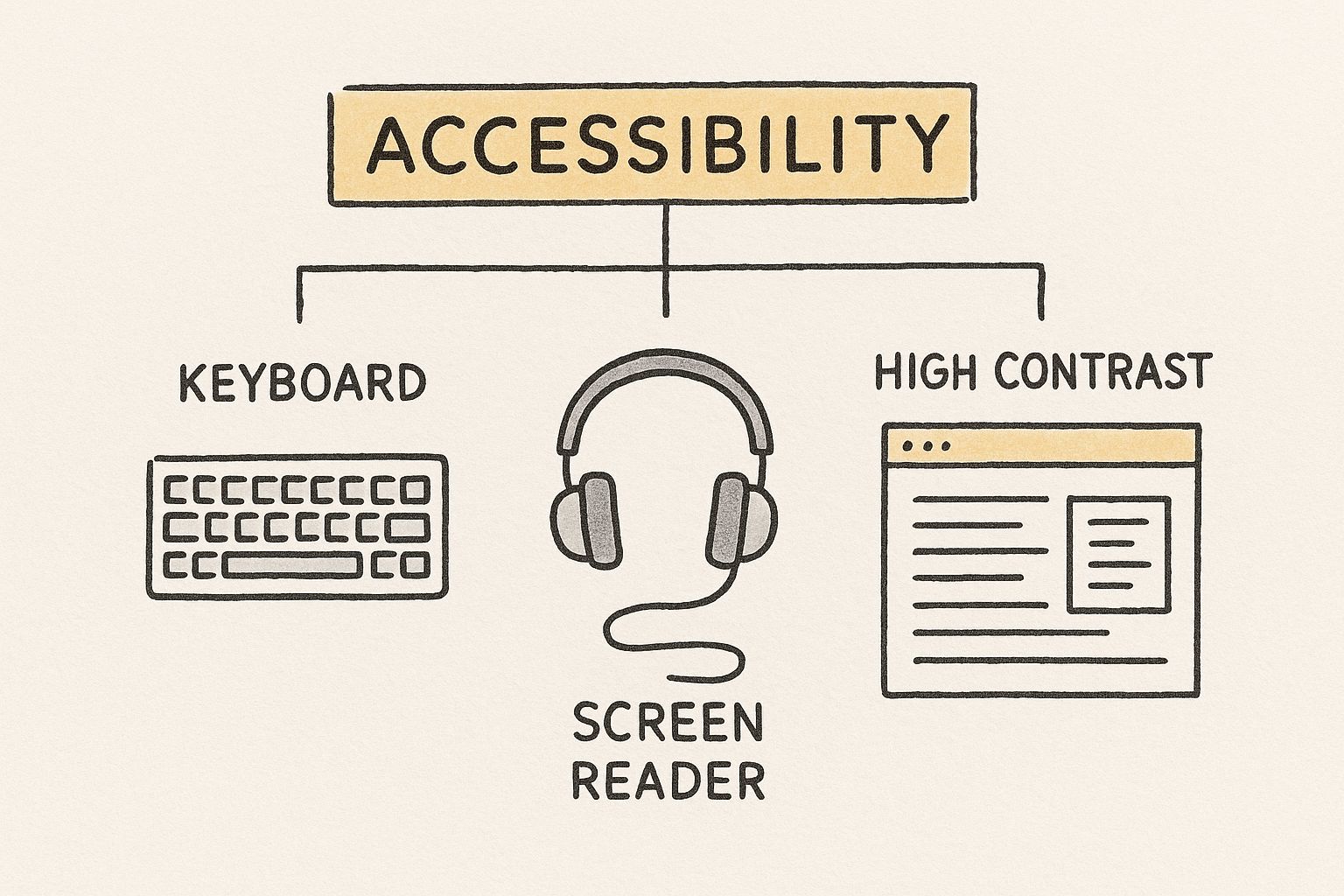
The infographic above shows how seemingly simple website features like keyboard navigation, screen readers, and high-contrast text make a world of difference. These accessibility features improve usability for everyone. They ensure that all families, regardless of technical skills or disabilities, can access key information. This inclusive approach builds a stronger sense of community. Imagine a parent with visual impairments easily navigating the school calendar using a screen reader—it's a small change with a big impact.
AI: A Powerful Tool for Personalized Learning
Artificial intelligence (AI) is changing the game in education website design. Nearly 93% of web designers are using AI tools to improve their platforms, with over half leveraging AI for creating images and multimedia content to boost engagement. Learn more about web design statistics here. But the key is using AI strategically. It's not about adding bells and whistles; it's about solving real problems and creating a better experience for families.
To help illustrate the different ways AI can be implemented on education websites, let's take a look at the following table:
AI Implementation Options for Education Websites
| AI Feature | Primary Benefit | Implementation Difficulty | Cost Impact | User Impact |
|---|---|---|---|---|
| Chatbots | Provides instant answers to common questions 24/7 | Easy to Moderate | Low to Medium | Improved access to information |
| Personalized Content Recommendation | Delivers targeted information based on user behavior and preferences | Moderate to High | Medium to High | Increased engagement and relevance |
| AI-Powered Search | Improves search accuracy and provides more relevant results | Moderate | Medium | Enhanced user experience |
| Automated Content Creation (e.g., image generation) | Saves time and resources for content development | Easy to Moderate | Low to Medium | More engaging visuals |
| Accessibility Tools (e.g., AI-powered transcription) | Makes content accessible to a wider audience | Easy to Moderate | Low to Medium | Improved inclusivity |
As you can see, different AI tools offer distinct advantages, and the right choice depends on your school’s specific needs and resources. While some solutions are relatively easy and inexpensive to implement, others require more significant investment and technical expertise.
Chatbots: Instant Answers, Human Touch
Think about all the common questions that come into your school’s inbox every day. A well-designed chatbot can answer those questions instantly, around the clock. This frees up your staff to focus on more complex issues and provides families with the quick support they need. It's not about replacing human interaction; it's about making sure everyone gets the information they need, when they need it. A chatbot can handle simple inquiries about school hours or lunch menus, while your staff can dedicate their time to personalized support and more in-depth conversations.
Personalized Content: Helping Families Find What They Need
Every family is different. They have different needs, different priorities, and different ways of interacting with your school. Personalized content allows you to tailor their online experience, delivering relevant resources right when they need them. Imagine a system that suggests after-school activities based on a student’s grade level or displays upcoming events tailored to a family's interests. This targeted approach boosts engagement by making sure families don't have to wade through irrelevant information. This ties in nicely with effective content marketing strategies; Content Marketing for Schools offers some helpful insights.
Choosing the Right Tools: Enhancing, Not Overcomplicating
While the possibilities of modern technology are exciting, the most important thing is to choose tools that truly enhance the educational experience, not just add complexity. The goal is to streamline communication, improve user experience, and preserve the personal connections that are at the heart of a strong school community. By choosing the right tools, you empower your school to connect with families in more meaningful and effective ways.
Your Practical Roadmap To Education Website Excellence
Imagine your school's website as its digital front door. It's often the first impression families, prospective students, and community members have of your institution. A well-designed website, much like a welcoming entryway, invites people in and encourages them to explore. This isn’t about fancy bells and whistles, but about creating a functional and user-friendly online experience. Just as a digital transformation roadmap guides businesses, this guide will provide practical steps for improving your school's website.
Prioritizing Action and Measuring What Matters
Let's be realistic. School budgets are tight, technical expertise might be limited, and to-do lists are long. Whether you're undertaking a full website redesign or simply tweaking your existing site, it’s important to prioritize actions and measure their impact. Forget vanity metrics like page views. Focus on meaningful engagement. Think about what actions you want visitors to take on your site and how that strengthens your school's connection with the community. Is it easier access to school forms? More parent involvement in school events? Identify those key goals and work towards them.
Think of your website as a garden. You wouldn’t simply plant seeds and walk away. You nurture them, weed regularly, and adjust your approach based on what thrives and what doesn’t. This same iterative process applies to your website. Start small, make consistent improvements, and watch your digital garden flourish.
Gathering Feedback and Iterative Improvement
Speaking of gardens, let’s talk about how to get your “green thumb” for website development. The key is user feedback. This doesn’t require elaborate systems. Think simple: short online surveys, informal parent forums, even quick polls at school events. Ask questions like, "What are you looking for on our website?" or "What could be easier to find?" These simple methods provide invaluable insights into what’s working and where users are getting stuck.
Once you have feedback, prioritize changes based on real needs. Maybe parents are struggling to find the school calendar, or teachers need quicker access to district policies. Perhaps a better search function is more crucial than adding new photos. These iterative adjustments, based on community feedback, are the stepping stones to a truly valuable website.
Demonstrating ROI and Securing Support
So you’ve made improvements. Now, how do you show their impact? Imagine presenting data to your administrators demonstrating a 20% increase in parent portal usage after a navigation update or a 15% boost in event registrations after simplifying the mobile experience. These measurable results demonstrate the real return on investment in your website. This isn’t just about justifying your work; it’s about building a case for continued support and resources for future development.
Adapting to Your School's Needs
Every school is unique. A small rural school will have different website needs and resources than a large urban district. Whether you have a dedicated web developer or a team of volunteers, the core principles remain the same: focus on user experience, gather feedback, and continually improve. By empowering your school with a strong online presence, you’re building a stronger community, one click at a time.
Ready to elevate your school’s marketing and communications? Join The MarCom Society – an exclusive community for K-12 professionals. Gain access to expert presentations, workshops, and resources to enhance your communication strategies and connect with fellow educators.