Ready to turn more of your school's website visitors into interested families? It all begins with a clear, data-driven strategy. Before you can improve your website conversion rates, you need to build a solid foundation by looking at your current performance, setting clear goals, and truly understanding your audience.
This initial work ensures every change you make down the line is strategic, not just a shot in the dark.
Building Your Foundation For Higher Conversions
It's tempting to jump straight into quick fixes or a full-blown website redesign, but that's like starting a road trip without a map. You'll waste a lot of time and energy. Instead, we need to lay the groundwork first.
For K-12 marketers, this is about shifting your website from a passive digital brochure into an active enrollment machine. It’s a methodical process for finding out exactly where your enrollment funnel is leaking and, more importantly, why.
Are parents getting to the tuition page and then leaving? Is the 'Schedule a Tour' button buried somewhere they can't find it? Answering these questions starts with a plan.
Start With A Baseline Audit
First things first, you need to conduct a thorough conversion audit. Think of it as a diagnostic for your website. This is where you dig into the data to see exactly where potential families are dropping off.
By analyzing how users actually behave on your site, you can pinpoint specific friction points—maybe it’s confusing navigation, unclear messaging, or even a technical glitch. A good audit gives you the "why" behind your current numbers.
Define Clear and Measurable Goals
Once you know where you stand, you have to decide where you're going. Vague goals like "get more inquiries" won't cut it. You need to get specific and set measurable targets that you can track.
For example, your goals might look something like this:
- Increase campus tour sign-ups by 15% in the next quarter.
- Boost downloads of our admissions guide by 20%.
- Reduce the bounce rate on the 'Admissions Process' page by 10%.
Having clear targets keeps your team focused and makes it easy to see what’s working. To build a strong base for boosting your conversions, you can explore more detailed strategies on how to improve website conversion rates.
A strong value proposition is the heart of high-converting pages. It's the clear, compelling promise of value you offer to a prospective family—what makes your school the right choice for their child. Without this, even the best-designed website will struggle.
Understand Your Parent Personas
Finally, you have to know who you’re talking to. The parent considering your elementary school has very different concerns than the parent looking at your high school.
Developing detailed parent personas helps you customize your messaging and user experience to fit their unique needs and motivations. You can learn more about crafting a message that resonates by understanding what is a value proposition and how it applies to your school's unique offerings.
This simple, three-part process—audit, set goals, and define personas—is the bedrock of a successful CRO strategy.
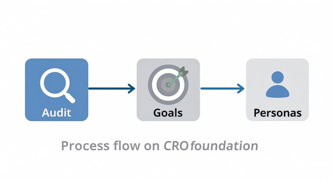
To help you get started, here's a quick summary of this foundational framework.
Initial CRO Framework for Your School Website
| Component | Objective | Key Action |
|---|---|---|
| Conversion Audit | To identify current performance issues and "leaks" in the enrollment funnel. | Analyze user behavior data (e.g., Google Analytics, heatmaps) to find drop-off points. |
| Goal Setting | To define what success looks like with specific, measurable targets. | Set SMART goals for key actions like tour bookings, form submissions, or guide downloads. |
| Parent Personas | To deeply understand the needs, motivations, and pain points of your target audience. | Create detailed profiles for different parent segments to guide messaging and UX decisions. |
By grounding your efforts in data and a deep understanding of your audience from the very beginning, every change you implement becomes a calculated step toward turning more website visitors into enrolled families.
Finding the Leaks: A School-Specific Conversion Audit
Before you can boost your enrollment numbers, you have to figure out where you're losing people. Think of a conversion audit as a diagnostic for your school's website. It’s designed to pinpoint exactly where prospective parents get confused, lose interest, or simply give up and leave. This isn't about making educated guesses; it's about getting real data to back up every change you make.
Your website is often the first "walkthrough" a family takes of your school. The goal is to make that virtual walk as smooth and inviting as possible. An audit helps you find the bumps in the road, the missing signs, and the dead ends that stop families from taking that next step—whether it's scheduling a tour, requesting info, or starting an application.
Start with the "What" and "Where": Digging into Your Analytics
Your first port of call should be your website analytics, which for most schools is Google Analytics. This is where you'll find the hard numbers—the quantitative data that tells you what users are doing and where they're doing it. Don't get overwhelmed by all the charts and graphs. Instead, zoom in on a few reports that tell the story of your enrollment funnel.
Look at your most-visited pages first. You need to know which pages parents are flocking to and, just as important, which ones have a high exit rate. The exit rate is simply the percentage of people who leave your website from that particular page.
For example, what if your 'Tuition & Fees' page has a 70% exit rate? That’s a major red flag and could mean a few things:
- Your tuition information is confusing or hard to find.
- Parents are getting "sticker shock" because you haven't framed the cost with the value your school provides.
- There's no clear next step. Is there a prominent link to financial aid or a "Contact an Admissions Counselor" button?
Identifying these high-exit pages gives you an immediate a-list of problem spots to tackle. For a more detailed walkthrough on this process, our guide on how to do a website audit offers a great framework for this initial data dive.
See What Parents See: Visualizing Behavior with Heatmaps
Analytics tell you what happened, but heatmap tools like Hotjar or Crazy Egg show you how it happened. Heatmaps give you a visual story of user behavior, offering that crucial qualitative layer of insight. They are fantastic for understanding what it’s actually like for a busy parent to browse your site on their phone or laptop.
You'll want to look at three main types of heatmaps:
- Click Maps: These show you exactly where people are clicking. Are parents trying to click on a photo or a heading that isn't actually a link? That's a clear sign of a frustrating user experience and a missed opportunity.
- Scroll Maps: This is a big one. A scroll map shows how far down a page people actually go. If 80% of your visitors never make it past the halfway point on your main admissions page, they're definitely missing that critical call-to-action you placed at the very bottom.
- Move Maps: These track where the mouse cursor hovers, which is often a good indicator of where someone is looking. Move maps can tell you which headlines, photos, or testimonials are really grabbing attention.
When you put your quantitative data from analytics together with the qualitative, visual insights from heatmaps, you get the full picture. You go from knowing a page is performing poorly to understanding the why behind it.
Let's say a heatmap shows that almost nobody is clicking your main 'Schedule a Tour' button. A quick look might tell you why. Maybe the button's color is too similar to the background, or perhaps it's located in a "cold" section of the page that scroll maps show people are flying right past.
This is the kind of practical, actionable information an audit delivers. It’s the foundation for making smart, sustainable improvements to your website and turning it from a static online brochure into your most powerful enrollment tool.
Creating a Better Online Experience for Prospective Parents
Let's be honest: a confusing website is a lead-killer. It’s often the number one reason a prospective parent clicks away. To get more families to inquire, you need to sharpen your site's user experience (UX) and messaging so it speaks directly to their hopes and worries. It's time to move beyond the digital brochure and create an online space that feels intuitive and welcoming.
Think of your website as the very first campus tour a family takes. If the signs are confusing or the information is buried, they'll get frustrated. That frustration quickly turns into a lack of confidence in your school, long before they ever step foot on campus. A smooth, clear experience, on the other hand, builds instant trust and makes them genuinely excited to learn more.

Unclutter Your Navigation and Site Structure
Prospective parents are busy people. They're juggling work, family, and a million other things, so they don't have time to solve a puzzle just to find basic info on your website. Your navigation needs to be so straightforward that a first-time visitor can find 'Admissions,' 'Tuition,' and 'Academics' in a matter of seconds.
A clean, logical site structure is everything. Group related pages under headings that make sense to parents, not just your staff. Instead of internal jargon like "Student Life," try something more descriptive like "Athletics & Clubs" or "Our Community." For a deeper dive into mapping this out, our guide on strategic school website design has some great, actionable advice.
Write Calls to Action That Actually Work
Your call-to-action (CTA) buttons are the signposts guiding parents down the path to enrollment. Vague, passive phrases like "Submit" or "Click Here" are dead ends. They don’t create any urgency or excitement.
To make your CTAs count, use action-oriented language that spells out exactly what the parent gets in return. It’s a simple tweak that can make a huge difference in your conversion rates.
From Weak to Strong CTAs
| Weak CTA (Generic) | Strong CTA (Benefit-Driven) |
|---|---|
| Submit | Get Your Info Pack Now |
| Learn More | Discover Our Programs |
| Contact | Schedule Your Personal Tour |
See the difference? The stronger CTAs create a sense of immediate value and answer the parent’s silent question: "What’s in it for me?" This little shift in wording turns a boring button into an enticing opportunity.
Speak Parent, Not "Education-ese"
School websites are notorious for being filled with jargon—pedagogy, asynchronous learning, holistic development. These terms might mean something to educators, but to parents, they can be confusing or even intimidating. Your messaging needs to be grounded in the outcomes and benefits they actually care about.
So, instead of saying you have a "robust, student-centered curriculum," show them what that really means. Talk about how your small class sizes lead to one-on-one attention that helps every child find their confidence. Explain how your hands-on learning approach builds real-world problem-solving skills.
The key is to shift from features (what you have) to benefits (what their child gets). A parent isn't shopping for a science lab; they're looking for a place that will spark their child's curiosity for a lifetime.
When you use benefit-driven language, you help parents picture their child thriving at your school. That emotional connection is what ultimately pushes them to take the next step.
Let Your Community's Voice Build Trust
When it comes to a decision as big as choosing a school, nothing is more persuasive than hearing from other families. Parent testimonials, student stories, and alumni spotlights—what we call user-generated content (UGC)—provide the social proof that builds genuine trust.
Don't just sprinkle a few quotes on your homepage. Weave these authentic stories throughout your entire site. Put a powerful parent testimonial right on the tuition page to reinforce the value of the investment. Feature a short video of a student sharing their favorite memory on the "Why Our School" page.
The data backs this up. Visitors who engage with UGC are 102% more likely to convert. And don't forget the technical side; a site that loads in one second sees nearly triple the conversion rates of a site that takes five seconds. When you combine a fast, easy-to-navigate website with the authentic voices of your community, you create an incredibly powerful experience for prospective families.
Implementing a Smart A/B Testing Plan
Guesswork doesn't get you very far. We’ve all been in those meetings, debating whether a blue or green "Apply Now" button is the right choice. The truth is, you don't have to guess. You can just test it and let prospective parents show you what they prefer.
That’s the whole point of A/B testing, and it’s the closest thing we have to a scientific method for improving a school website. It takes the guesswork and personal opinions out of the equation, letting real user behavior guide your decisions.
The concept is simple. You create two versions of a webpage: version "A" is your original (the "control"), and version "B" has one specific change you want to test. Then, you show each version to different segments of your audience and see which one performs better. This is how you turn a static online brochure into a dynamic enrollment machine.
Building Your First High-Impact Test
Don't overcomplicate your first test. The key is to start with high-impact, low-effort changes that can give you some quick momentum. You really don’t need to redesign an entire page to see a difference.
Before you start, you need a solid hypothesis. Think of it like a mini-experiment. A good hypothesis follows a simple structure: "By changing [X] to [Y], we believe we can increase [metric] because [reason]." This simple sentence forces you to be clear about what you're testing and why.
Here are a few ideas perfectly suited for a school website:
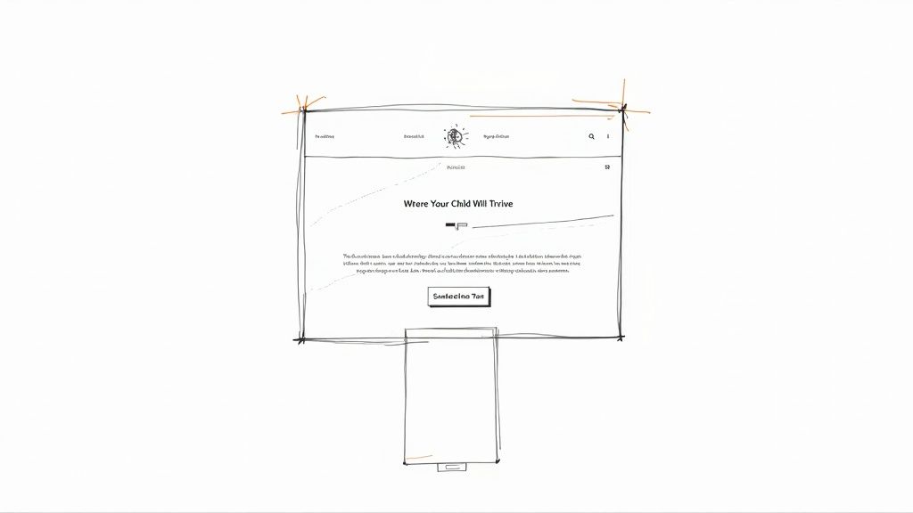
- Admissions Page Headline: Test a traditional headline like "A Tradition of Excellence" against something more parent-focused, like "Discover Where Your Child Will Thrive." Which message actually connects with what families are looking for?
- Inquiry Form Length: This is a classic. Create a second version of your "Request Information" form with one or two fewer fields. Your hypothesis is that a shorter form will increase submissions by making it easier for busy parents.
- Homepage Imagery: What do parents respond to more? Test your current hero image of the beautiful school building against an action shot of students collaborating on a project.
Interpreting Your Results to Drive Strategy
Once a test has run long enough to gather enough data (the software will tell you when it’s “statistically significant”), it’s time to see what happened. The winning version is simply the one that got you more of what you wanted—more clicks, form submissions, or campus tour sign-ups.
But don't just pop the champagne and move on. The real magic is in understanding the why.
If the headline "Discover Where Your Child Will Thrive" won, that’s a powerful insight. It tells you that your audience is more motivated by a student-centric, future-focused message than by tradition. Now you can take that learning and apply it to your email campaigns, social media posts, and even your viewbook.
A/B testing isn't just about picking winners and losers on a webpage. It's a continuous learning process. It’s direct feedback from the families you’re trying to reach, telling you what they care about and what motivates them.
It also helps to know where you stand. Across all industries, average conversion rates tend to hover around 2.5% to 3.0%. But traffic sources matter immensely—referral traffic often converts at a much higher 5.4%, while social media traffic might only convert at 0.7%. Knowing this helps you set realistic goals. If you want to dig deeper into benchmarks, you can find more context from these average conversion rate findings.
By adopting a testing mindset, your school's website is never truly "finished." It becomes a living asset that constantly adapts to better meet the needs of prospective families, driving more qualified inquiries and, ultimately, boosting enrollment.
Actionable Quick Wins to Boost Conversions Now
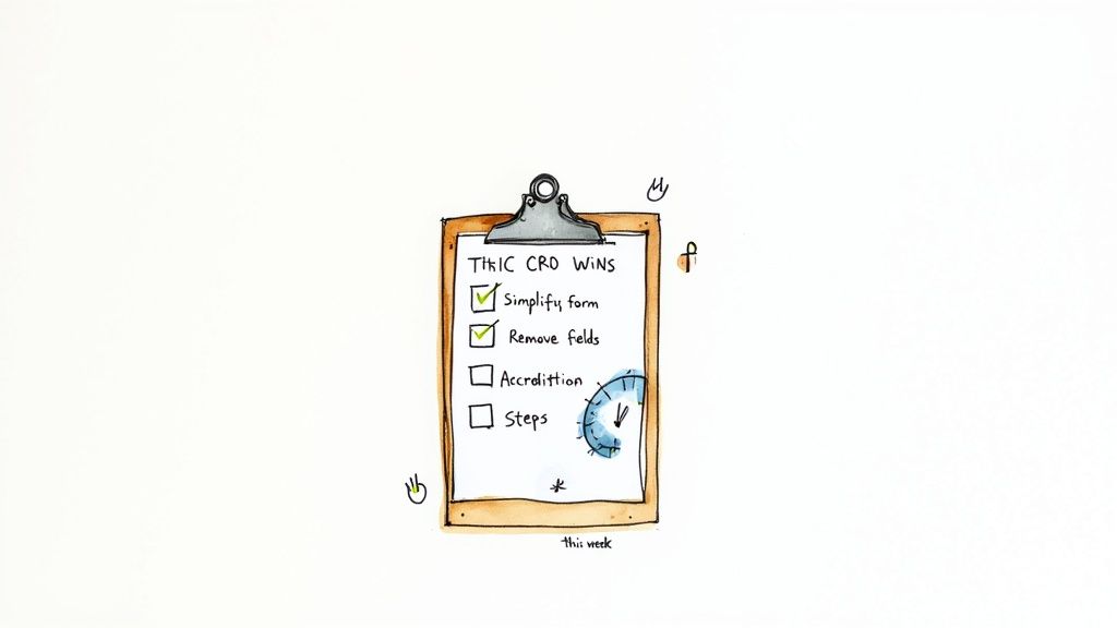
While a full-blown CRO strategy is the end goal, you don't have to wait months to start seeing real results. There are a handful of high-impact tweaks you can make right now that will move the needle almost immediately.
Think of these as the low-hanging fruit—small changes that build momentum and prove to your team that improving your website’s performance is not just possible, but well within reach. It’s all about removing the little points of friction that stop interested parents in their tracks.
Simplify Your Inquiry and Application Forms
I can’t stress this enough: long, complicated forms are conversion killers. For every extra field you ask a parent to fill out, you give them another reason to second-guess the process and click away. Your first goal is simply to open a line of communication, not to collect a complete student file.
Take a hard look at your "Request Information" and initial application forms. Ask yourself, honestly:
- Do we absolutely need the child’s middle name at this stage?
- Is a secondary phone number critical for the very first touchpoint?
- Can the detailed academic history wait until they are further along in the admissions funnel?
Just removing one or two unnecessary fields can have a massive impact. Expedia famously boosted their profits by $12 million by cutting a single, optional field from their booking form. The principle is exactly the same for your school's enrollment process.
Tackle Application Abandonment Head-On
Application abandonment is your school's version of the abandoned online shopping cart. In e-commerce, abandonment rates hover around 70%, often because of unexpected costs or a clunky checkout. While you’re not selling shoes, the psychology is identical. Parents will bail if the process becomes a headache or springs a surprise on them.
To get ahead of this, you need to make your application experience as smooth and transparent as possible.
- Break it into chunks: If you have a long application, split it into smaller, logical steps. A progress bar can make the entire task feel much less overwhelming.
- Be upfront about fees: Don't hide the application fee until the very last page. Mention it clearly at the beginning so parents know what to expect.
- Let them save their work: Life gets in the way. Allow busy parents to save their progress and come back later. This simple feature shows you respect their time.
A smooth, transparent application process signals respect for a parent's time. It’s a powerful, non-verbal way of showing that your school is organized and considerate—qualities every parent looks for.
Instantly Build Trust and Credibility
Trust is the currency of enrollment marketing. The moment a parent lands on your website, their brain is scanning for signals that your school is legitimate, reputable, and a safe environment for their child. You can boost these trust signals in minutes.
Make sure these elements are front and center, especially on your homepage and key admissions pages:
- Accreditation Logos: Put those official logos where people can see them. They carry weight.
- Awards and Recognitions: If you've been recognized for anything, show it off!
- Clear Contact Info: An easy-to-find phone number and physical address are basic but powerful trust indicators.
- A Fast-Loading Site: Nothing kills credibility like a slow, buggy website. It just feels unprofessional. To make sure your site feels reliable and modern, you need to optimize website load speed.
By putting these quick wins into action, you can make an immediate, positive impact on your website's ability to turn curious visitors into genuinely engaged families.
Answering Your Top Questions About School Website Conversions
Even with the best roadmap, you’re bound to have questions. I get it. Here are some of the most common things school marketers ask me when they start digging into conversion rate optimization, along with my straight-to-the-point answers.
What Is a Good Conversion Rate for a School Website?
I see this one a lot. While industry benchmarks can be helpful, a solid conversion rate for crucial actions like tour sign-ups or inquiry form submissions usually lands somewhere between 2% and 5%.
But here's the thing: that number is heavily influenced by your traffic quality. Instead of getting hung up on a universal magic number, I always recommend you benchmark against your own historical data. Your real goal is steady, continuous improvement over time.
Where Should I Start With a Limited Budget?
When the budget is tight, you have to hunt for the "low-hanging fruit." The best place to start is right inside your Google Analytics account. Look for pages that get a lot of traffic but aren't converting well. Those are your gold mines.
From there, you can roll out some powerful, zero-cost changes:
- Rewrite your page headlines. Make them laser-focused on what parents are looking for.
- Simplify your forms. Can you remove just one or two non-essential fields? Do it.
- Make your calls-to-action pop. Give them a distinct color and make them impossible to miss.
Another quick win that costs nothing but a bit of your time? Gather fresh parent testimonials and strategically place them on your most important pages. The social proof is incredibly powerful.
Don't underestimate the power of small, free adjustments. A clearer headline or a simplified form can reduce friction significantly, leading to immediate gains without touching your budget. This is where you build momentum.
How Long Does It Take to See CRO Results?
You might be surprised. For some changes, results can show up incredibly quickly. A simple A/B test on a high-traffic page—say, changing a button color or tweaking a headline—can deliver statistically significant results in just a few weeks.
Of course, bigger projects like redesigning your entire admissions section will take a few months to fully implement and measure. The key is consistency. Think of CRO as an ongoing process of testing, learning, and refining your approach, not a one-and-done project.
Ready to stop guessing and start building a website that truly connects with prospective families? At The MarCom Society, we provide K-12 marketers with the expert guidance, practical workshops, and supportive community needed to master strategies like these. Join us to access the tools and insights that turn website visitors into enrolled families.