If you want to boost your website's conversions, you need a fundamental shift in mindset. It’s not about chasing vanity metrics; it's about getting inside the heads of prospective parents and understanding their journey from curiosity to commitment. The process is methodical: diagnose the friction, deploy targeted fixes, and test everything. This isn't about throwing spaghetti at the wall to see what sticks—it’s a disciplined approach.
Your Framework for Better Conversions
Improving your school's website performance isn't magic. It comes down to following a structured, repeatable framework that turns guesswork into a reliable growth engine. This system allows you to stop wondering what might work and start making data-driven decisions that deliver real, measurable results. The ultimate goal is to pave a smooth, intuitive path for every visitor, gently guiding them from their first click to taking that final, important step.
At its core, this is all about Conversion Rate Optimization (CRO). If you're new to the term, it's worth understanding what Conversion Rate Optimization entails. In short, it’s the practice of systematically improving your website experience to increase the percentage of visitors who complete a desired action—like submitting an inquiry, scheduling a tour, or starting an application.
This simple, three-step growth framework breaks it down perfectly. It’s a continuous loop of pinpointing problems, optimizing with data, and growing your results.
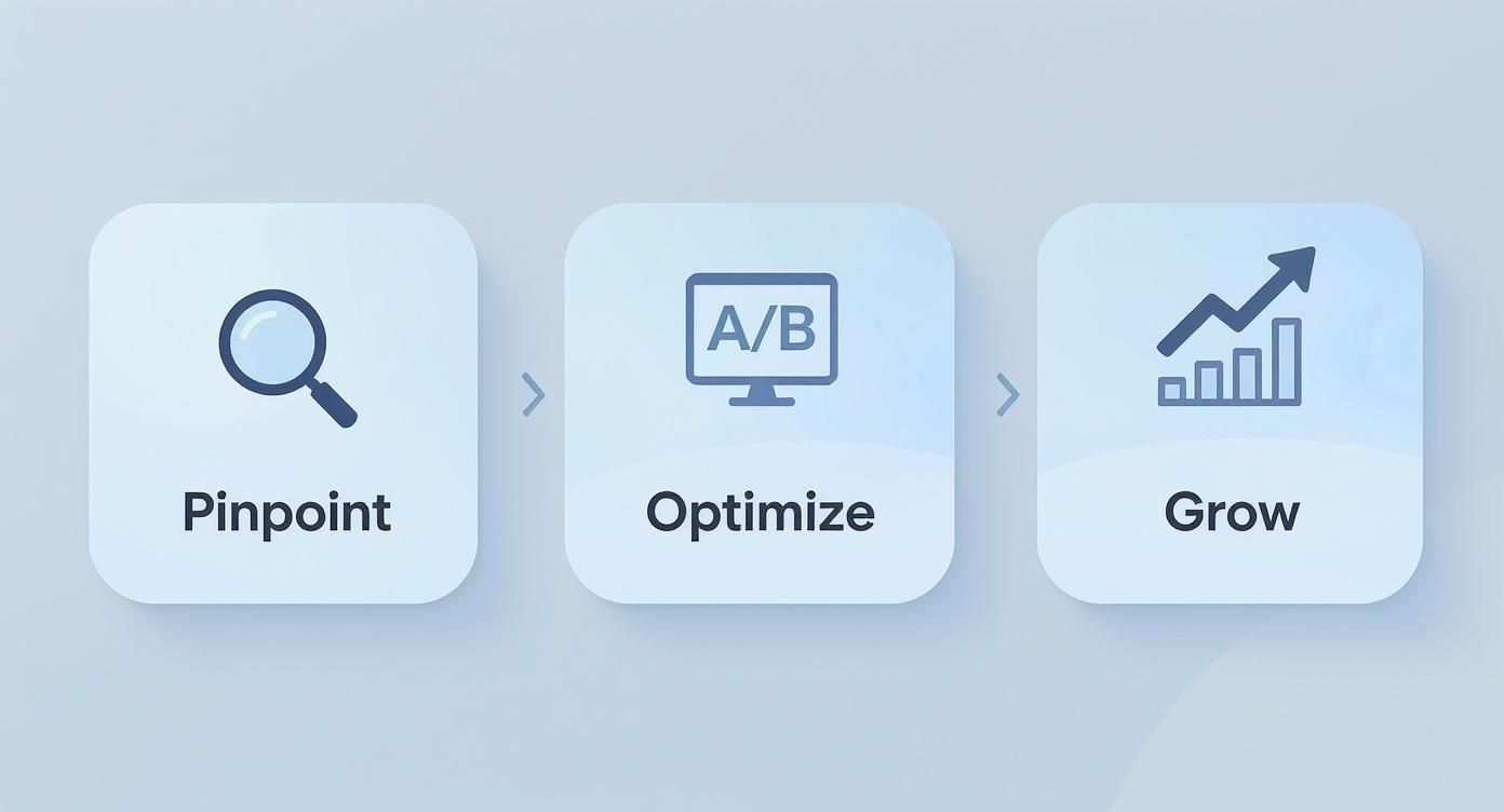
This visual drives home a critical point: sustainable growth isn't about a single magic bullet. It’s born from a relentless cycle of analysis, action, and learning.
Why Conversions Matter More Than Ever
Every single interaction a prospective parent has with your website is a make-or-break moment. It's an opportunity to build a connection or lose a family forever. A clunky, confusing experience doesn't just cost you an inquiry; it subtly chips away at your school's reputation. On the flip side, a seamless, helpful website instantly communicates professionalism and care, reinforcing the very qualities you want your brand to be known for.
Even small, incremental improvements can have an outsized impact. Just look at the broader market: the global ecommerce conversion rate is expected to climb from 2.4% in 2023 to 2.7% by 2025. That seemingly small 0.3% jump represents a 12.5% increase in performance, driven by deliberate optimizations.
It's time to stop thinking of your website as a digital brochure and start treating it as your hardest-working admissions officer. It's on duty 24/7, answering questions, building trust, and nudging parents toward action.
To get there, we'll focus on several core pillars of optimization. These are the foundational areas where targeted improvements will yield the biggest returns for your school.
Core Conversion Optimization Pillars
| Pillar | Objective | Key Actions |
|---|---|---|
| Landing Pages | Create a focused, persuasive experience for a specific audience. | A/B test headlines, simplify content, and align messaging with the ad or email that brought the visitor there. |
| Calls to Action (CTAs) | Make it obvious and compelling for users to take the next step. | Use action-oriented language, test button colors and placement, and ensure clarity. |
| Forms | Reduce friction and make it as easy as possible to submit information. | Shorten form fields, use clear labels, and provide inline validation and error messages. |
| Messaging | Communicate your school's value proposition clearly and resonate with parent needs. | Focus on benefits over features, address common objections, and use authentic social proof. |
| Trust Signals | Build immediate credibility and reassure parents they're making the right choice. | Display accreditations, testimonials, security badges, and clear contact information. |
| Technical Performance | Ensure a fast, reliable, and accessible experience for everyone. | Optimize page speed, ensure mobile-friendliness, and adhere to accessibility (WCAG) standards. |
These six pillars form the backbone of a high-converting website. Throughout this guide, we'll dive deep into each one, giving you the practical, actionable steps you need to turn your site into a true enrollment-driving machine.
Finding Your Conversion Bottlenecks
Before you can fix your website's conversion problem, you have to play detective. Optimizing isn't about guesswork; it's about finding the exact moments of friction or confusion that make a prospective parent click away. This means digging deeper than surface-level stats like bounce rate to understand the why behind people's actions.
Your first step is to map out the real journey parents take on your site. Don't just look at which pages get the most traffic—trace the path they follow from one page to the next. Tools like Google Analytics have user flow reports that can be incredibly revealing, often showing you drop-off points you never would have expected.
For a really thorough investigation, a full-scale audit is the way to go. Our comprehensive guide on how to do a website audit walks you through the process, helping you uncover those pesky technical glitches that could be quietly killing your conversions.
Seeing Your Site Through a Parent's Eyes
Analytics tell you what is happening. To understand why it's happening, you need to see your site from a user's perspective. This is where the most powerful insights are hiding.
- Heatmaps: These tools, like Hotjar or Crazy Egg, show you a color-coded map of where people are clicking, scrolling, and moving their mouse. Are parents clicking on an image thinking it's a button? Are they completely scrolling past your main call-to-action? Heatmaps give you answers in an instant.
- Session Recordings: This is like looking over a parent’s shoulder as they browse your website. These are anonymous video recordings of real user sessions, showing every mouse movement, every click, and every frustrated jiggle when something doesn't work. Honestly, watching a handful of these is the fastest way to build empathy and spot real-world usability problems.
I once watched a session recording where a parent spent three full minutes trying to find the school calendar, eventually giving up after getting lost in the "About Us" section. That one little video was more valuable than any spreadsheet I could have pulled.
When you combine the hard numbers from your analytics with the human story from session recordings, you stop guessing. You finally understand the experience behind the data, and that’s how you identify changes that will actually move the needle.
Gathering Direct Feedback
Sometimes the easiest way to find out what’s wrong is just to ask. You don’t need to launch a massive research project—a few simple, well-placed questions can give you all the clarity you need.
Try adding a small, pop-up feedback widget or an exit-intent survey that asks one simple question: "Was there anything you were looking for today that you couldn't find?" The answers can be pure gold.
You should also become obsessed with your form analytics. If you see that 60% of parents start your inquiry form but only 20% actually finish it, you've found a major bottleneck. Is the form too long? Is one of the questions confusing? Go through it field by field to see exactly where they’re dropping off. This data replaces your assumptions with facts, giving you a clear, actionable list of problems to tackle first.
Designing High-Impact Landing Pages
Think of your landing page as a laser-focused sales pitch. When a prospective parent clicks an ad you’re running for your school's "Innovative STEAM Program," they absolutely should not land on your general homepage. That’s a recipe for a quick exit.
Instead, they need to arrive at a dedicated page that instantly confirms they’re in the right place. This seamless experience reinforces their decision to click and steers them toward one specific action you want them to take.
This simple concept is called message match, and it's the bedrock of a landing page that actually converts. The headline, the photos, and the copy on your page must be a direct reflection of the promise you made in the ad, email, or social media post that brought them there. It's all about creating a smooth, trustworthy transition that makes it easy for a busy parent to say "yes."

A disconnect here is jarring for the user. Imagine a parent clicking an ad to schedule a school tour, only to land on a page asking for donations. They’ll feel lost and confused, and their next click will almost certainly be the "back" button.
Anatomy of a Page That Converts
Beyond message match, a few core elements have to work together to persuade parents to take that next step. Think of these as the essential building blocks of a compelling argument. Every single element must have a clear purpose, all pushing toward that one goal: getting that form submission or phone call.
- A Compelling Headline: This is your first and, frankly, best chance to grab their attention. It needs to be benefit-driven, clearly stating what the parent stands to gain for their child. So, instead of a boring "Admissions Inquiry," try something like, "See How Our Students Thrive at Northwood Academy."
- Benefit-Oriented Copy: Let’s be honest: parents don’t really care about your features; they care about the outcomes for their children. Your job is to translate your school's features into tangible benefits. "Small class sizes" becomes "Personalized attention where your child will never feel overlooked." See the difference?
- Engaging Visuals: Use high-quality, authentic photos or short videos of your real students and teachers in action. Real imagery helps parents truly envision their child at your school, creating an emotional connection that sterile stock photos simply can't match.
Your landing page has one job. Every word, every image, and every button should be relentlessly focused on guiding the visitor toward that single conversion goal. Get ruthless and remove every distraction that doesn't serve this purpose.
The Science of a Powerful Call-to-Action
The Call-to-Action (CTA) is that final, crucial nudge. It’s not just a button; it's the trigger for the conversion, and its design and wording can make or break your page's performance.
Start by using action-oriented language that sets clear expectations. A generic "Submit" button is a missed opportunity. Use specific microcopy that tells them exactly what will happen next, like "Schedule Your Campus Tour" or "Download the Parent Guide." It removes uncertainty.
The visual design matters just as much. Your button's color should contrast sharply with the rest of the page, making it pop. You want it to be impossible to miss. Research has shown time and again that making CTAs stand out visually can significantly lift conversion rates.
Finally, make sure your page is clean and easy for everyone to use. Our guide on accessibility in web design has some great, practical tips on this. A clear, accessible design is a cornerstone of maximizing how you increase website conversions.
Make Your Forms and Checkout Effortless
A clunky, confusing form can stop a motivated parent dead in their tracks. This is it—the final step. After all your hard work getting them to this point, any friction here can send them packing, and you'll lose the conversion for good.
The goal is to make saying "yes" so easy that they don't even have to think about it. Every field they fill out, every click they make, adds a little bit of mental effort. Our job is to strip that effort away until the process feels completely seamless.
Cut the Clutter from Your Forms
When it comes to your forms, your guiding principle should be simple: less is more. I mean it. Question every single field. Is it absolutely critical right now to get this conversion? To schedule a campus tour, do you really need to know a parent’s job title or how they heard about you? Probably not.
One famous study found that cutting form fields from 11 down to just 4 boosted conversions by a staggering 120%. While that exact number might not be your reality, the lesson is universal. Go through your forms line by line and be ruthless. If a field is just a "nice-to-have" for your admissions team, cut it.
- Use Smart Defaults: Make life easier for parents. Pre-fill their country or state using their location, or pre-select the most common option in a dropdown menu.
- Allow Social Logins: For applications or parent portal sign-ups, letting someone use their existing Google or Apple account is a game-changer. It's one click instead of a dozen keystrokes.
- Give Real-Time Feedback: Don't wait until someone hits "submit" to tell them they made a mistake. Use inline validation to show a green checkmark for correctly filled fields and a clear, helpful error message ("Oops, please enter a valid email") the second they type something wrong.
The best form is the shortest one. You're not trying to collect a lifetime of data on the first interaction. You're trying to get a commitment and begin a relationship. You can always gather more information later.
Fine-Tuning the Checkout Experience
If your school takes online payments for application fees, event tickets, or donations, the checkout process is another major drop-off point. The average cart abandonment rate across all industries is a painful 70%, and a difficult checkout is one of the main reasons why.
Here are a few proven ways to smooth out this final step and keep those payments coming through:
- Always Offer Guest Checkout: Forcing a parent to create a full-blown account just to pay a $50 application fee is a conversion killer. Let them check out as a guest and remove that massive hurdle.
- Display a Progress Bar: People like to know where they stand. A simple visual guide showing the steps (e.g., Contact Info -> Payment -> Confirmation) reduces anxiety and makes the process feel manageable. It tells them the end is in sight.
- No Surprise Fees: This is the big one. Unexpected shipping costs, taxes, or processing fees that only appear on the final screen are the top reason people abandon a purchase. Be completely transparent about the total cost right from the start.
Building Trust to Overcome Hesitation
When a parent lands on your school's website, they're not just looking at your curriculum. They're sizing you up, asking themselves questions they might not even be aware of: Is this school legitimate? Can I trust them with my information? Is what they're saying really true?
In a crowded online world, trust is everything. It's the currency that turns a curious visitor into an enrolled family. Every single element on your page is either building that trust or chipping away at it. An old design, a broken link, or hard-to-find contact info can be all it takes for a motivated parent to hit the "back" button and never return.
Your job is to get ahead of their worries and dismantle those barriers before they even fully form.
This all comes down to strategically placing trust signals throughout your site. These are the little cues—both visual and informational—that reassure visitors they’re in the right place and making a good decision.
Showcase Authentic Social Proof
Let's be honest: the most powerful marketing voice you have isn't your own. It's the voice of a happy parent who's already part of your community. This is social proof in action, and it's based on a simple human truth: we tend to do what we see others doing. Time and again, we see that visitors who engage with reviews or testimonials are far more likely to take the next step.
Here’s how to put it to work:
- Parent Testimonials: Go beyond just a quote. Feature a real parent's name and, if they're comfortable, a genuine photo. The sweet spot for these is right next to a key call-to-action, like your "Schedule a Tour" button.
- Student Success Stories: Nothing connects like a story. A short video or a well-written profile of a student's journey at your school can forge a powerful emotional bond with a prospective family.
- Accreditation and Awards: Don't hide these! Display the logos from your accrediting bodies or any awards your school has earned. They act as instant, third-party validation of your quality.
People don’t trust brands; they trust other people. Your goal is to let your current families become your most effective marketers, reassuring prospective parents that they are in good company.
Demonstrate Security and Transparency
Parents today are savvy—and rightly cautious—about sharing personal information online. You have to show them, not just tell them, that your website is secure, especially on any page that asks for their details.
A simple but surprisingly effective tactic is to use security badges. An icon from a known name like Norton or even a generic "Secure SSL Connection" badge placed near a form's submit button can quiet those nagging security concerns and genuinely improve your form completion rates.
Beyond that, transparency is absolutely critical.
- An Accessible Privacy Policy: Don't bury it. Link to your privacy policy clearly in your website’s footer and write it in plain English. Explain exactly how you protect the data families share with you.
- A Humanized 'About Us' Page: Ditch the generic mission statement. Your "About Us" or "Our Team" page is a golden opportunity to build trust. Feature real photos of your head of school and admissions staff. Seeing the friendly faces behind the website makes your school feel less like an institution and more like a community.
By weaving these threads of social proof, security, and transparency into the fabric of your website, you systematically break down a family's hesitation. You create an environment where parents feel safe, seen, and confident—paving a smooth path to increase website conversions and start a great relationship with your school.
How to Measure and Test Your Optimizations
Making changes to your website without measuring the results is a bit like shooting in the dark. You're busy, but you have no idea if you're hitting the target. To truly move the needle on conversions, you need to get into a rhythm of testing, learning, and refining. This is where data stops being a buzzword and starts being your best friend.
Conversion optimization isn’t a one-and-done project. It’s a disciplined, ongoing process where analytics guide your every move. By tracking the right numbers, you can finally stop guessing and start making data-backed decisions that actually improve your admissions pipeline.
Defining Your Key Performance Indicators
Before you can measure success, you have to define what success actually looks like for your school. And it’s not just about the final application. You need to get a handle on the entire parent journey by tracking both big and small wins—what we call macro and micro-conversions.
Start by zeroing in on the Key Performance Indicators (KPIs) that really matter:
- Primary Conversion Rate: This is the big one. It’s the percentage of visitors who complete your most important goal, like submitting an inquiry form or starting an application.
- Conversion Rate by Channel: Where are your most engaged families coming from? A 2% conversion rate from a targeted Google Ads campaign is way more valuable than a 0.5% rate from a general social media post. This tells you exactly where to put your marketing dollars.
- Form Abandonment Rate: This metric is a goldmine. If 70% of parents start your inquiry form but only 30% hit "submit," you have a serious problem. Tracking this helps you pinpoint and fix frustrating roadblocks on your forms.
- Cost Per Conversion: At the end of the day, how much are you spending to get one solid inquiry? Knowing this number is crucial for proving your team's ROI and fighting for your budget.
Getting comfortable with these numbers is the first real step toward using data well. If you're new to this, getting a clear understanding of what marketing analytics is will give you a solid foundation for everything that comes next.
Running Meaningful A/B Tests
Once you have your baseline numbers, you can start testing your ideas. This is where A/B testing (also called split testing) comes into play. It’s a straightforward but incredibly powerful method where you show two different versions of a page to your audience at the same time to see which one performs better.
The trick is to start with a strong, clear hypothesis.
A good hypothesis isn't just a random guess; it's an educated statement you can prove or disprove with data. It follows a simple formula: "If I change [X], then [Y] will happen, because [Z]."
For example, a weak hypothesis is, "Let's try a new button color." A much stronger one would be, "If we change our 'Learn More' button from blue to a high-contrast orange, we’ll see an increase in form submissions, because the new button will be more visually prominent and guide the user's attention."
See the difference? This structure forces you to think through the why behind your test and ties every change back to a specific school goal.
Prioritizing Your Tests for Maximum Impact
You’ll probably come up with dozens of ideas for A/B tests. The secret is to prioritize them smartly, focusing on potential impact versus the effort it takes to get the test live. A simple matrix can be a game-changer here, helping you decide where to start.
A/B Testing Idea Matrix for Website Conversions
Use this simple framework to sort through your testing ideas. You're looking for the sweet spot: high-impact tests that are relatively easy to implement. These are your "quick wins" that build momentum.
| Test Element | Potential Impact (High/Medium/Low) | Implementation Effort (High/Medium/Low) | Example Hypothesis |
|---|---|---|---|
| Headline on Admissions Page | High | Low | Changing the headline to focus on student outcomes will increase tour requests. |
| CTA Button Copy | High | Low | Using "Schedule Your Tour" instead of "Submit" will improve form completions. |
| Number of Form Fields | High | Medium | Reducing the inquiry form from 8 fields to 5 will decrease form abandonment. |
| Page Layout Redesign | Medium | High | A single-column layout on the tuition page will reduce bounce rate. |
Start with the tests in that "High Impact, Low Effort" quadrant. Nailing a few of these early on is the best way to demonstrate the value of having a testing culture on your team.
At The MarCom Society, we believe in empowering school marketers with the strategies and support needed to drive real results. Join our community to access expert-led workshops, practical resources, and a network of peers dedicated to elevating K-12 communications. Learn more at https://marcomsociety.org.